MINERAL: A Holistic Approach to Jewelry Brand Design
As a creative director and designer, I approached the Mineral project with a holistic vision, crafting every aspect of the brand's identity from the ground up. This comprehensive design journey encompassed everything from the custom typography of the logotype to the ceramic packaging, from the architectural inspiration to the digital presence, creating a cohesive and distinctive brand universe.
The Concept: Celebrating Human Uniqueness
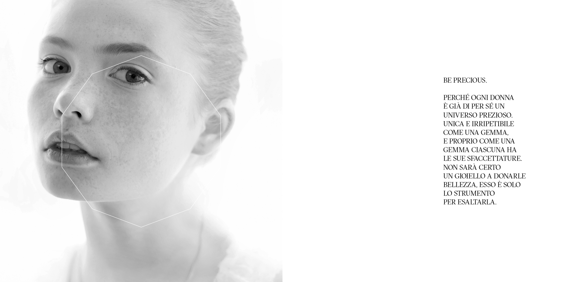
The foundational concept behind Mineral stems from a profound belief: the truly precious object is not the jewelry itself, but the person wearing it. The jewelry serves to enhance the wearer's uniqueness. This philosophy guided every design decision throughout the project, creating a brand experience that celebrates individuality and craftsmanship.
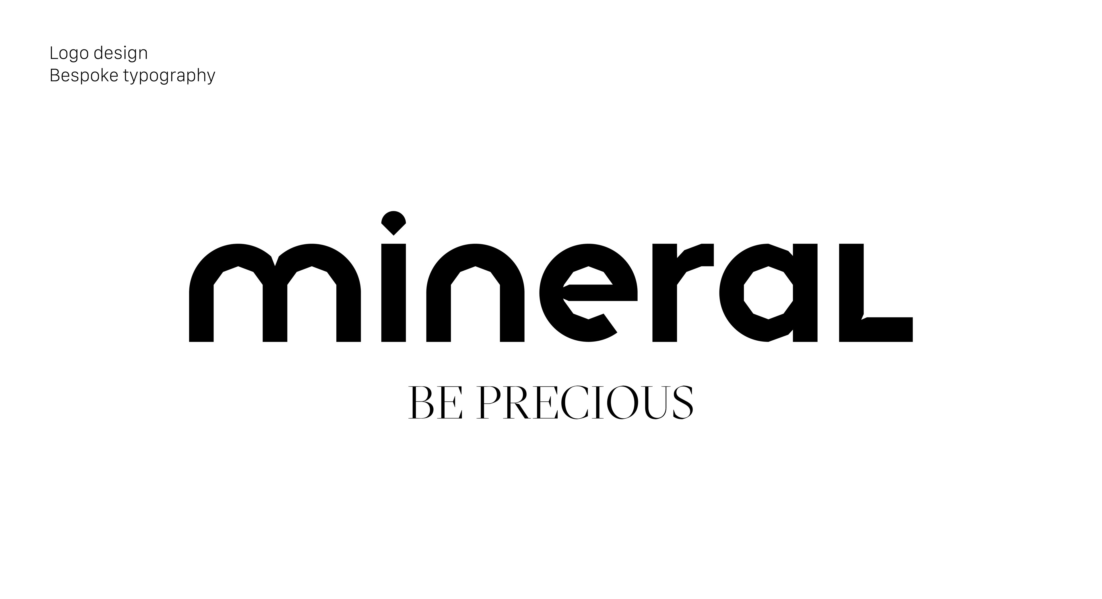
Custom Typography: Creating a Distinctive Voice
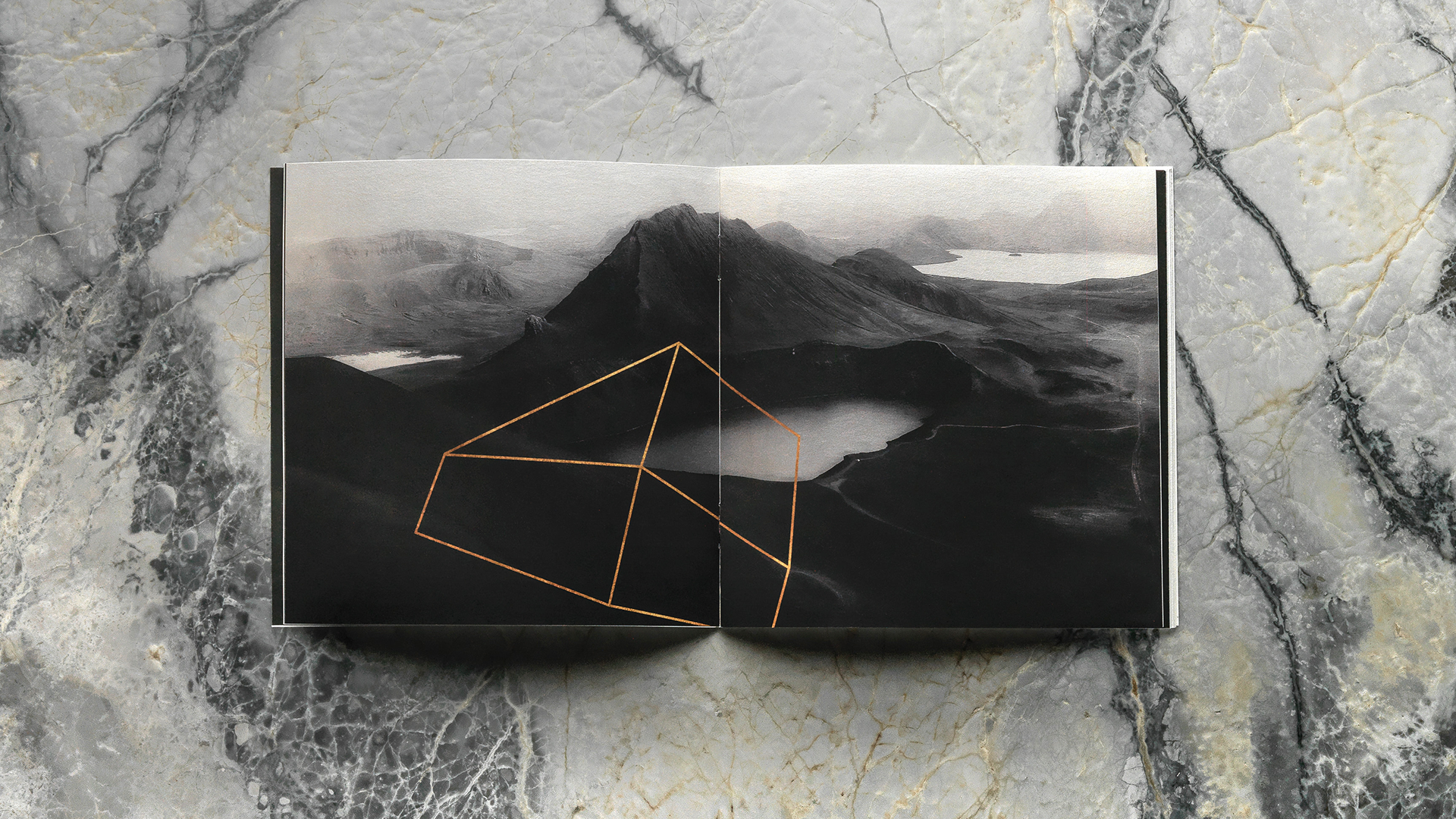
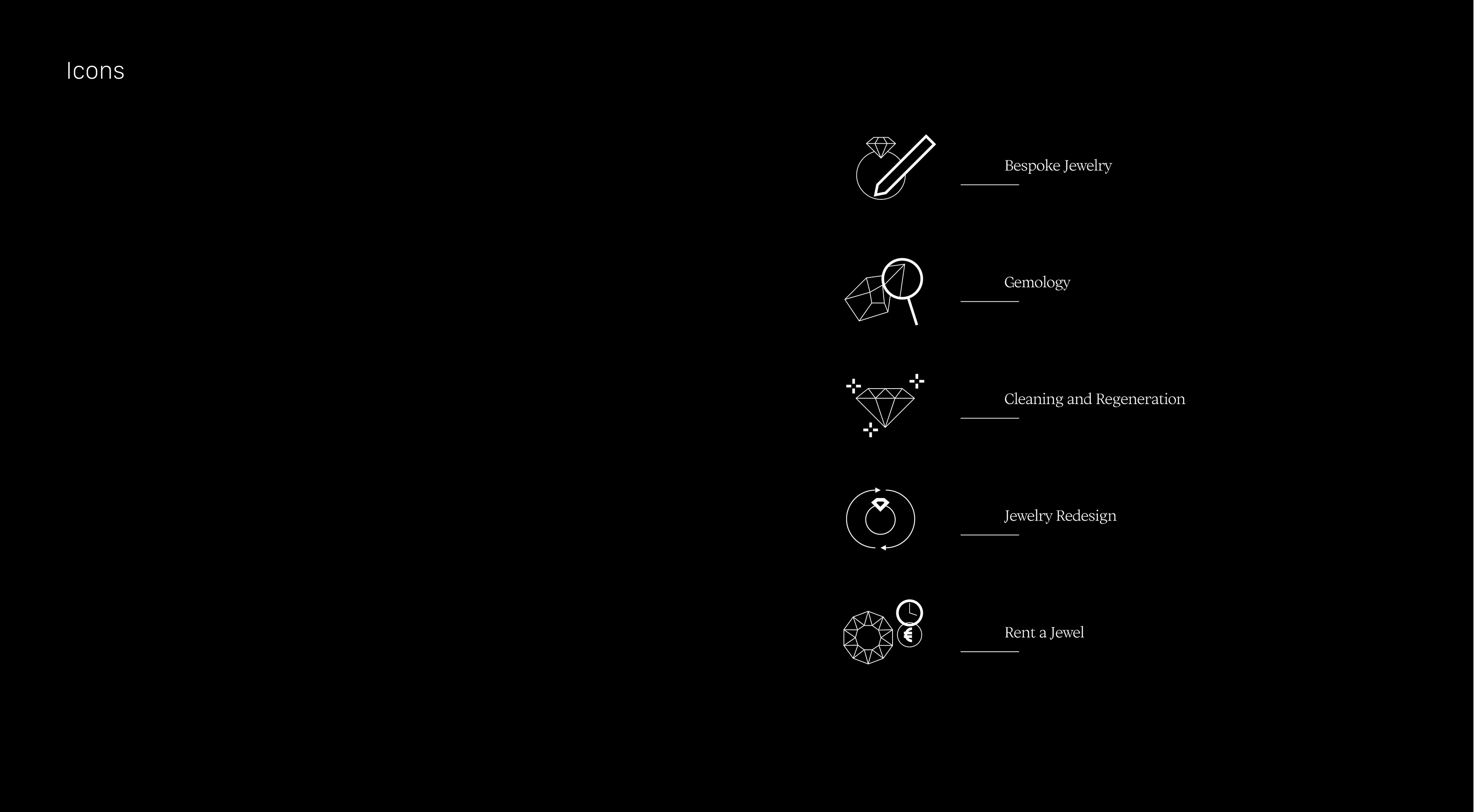
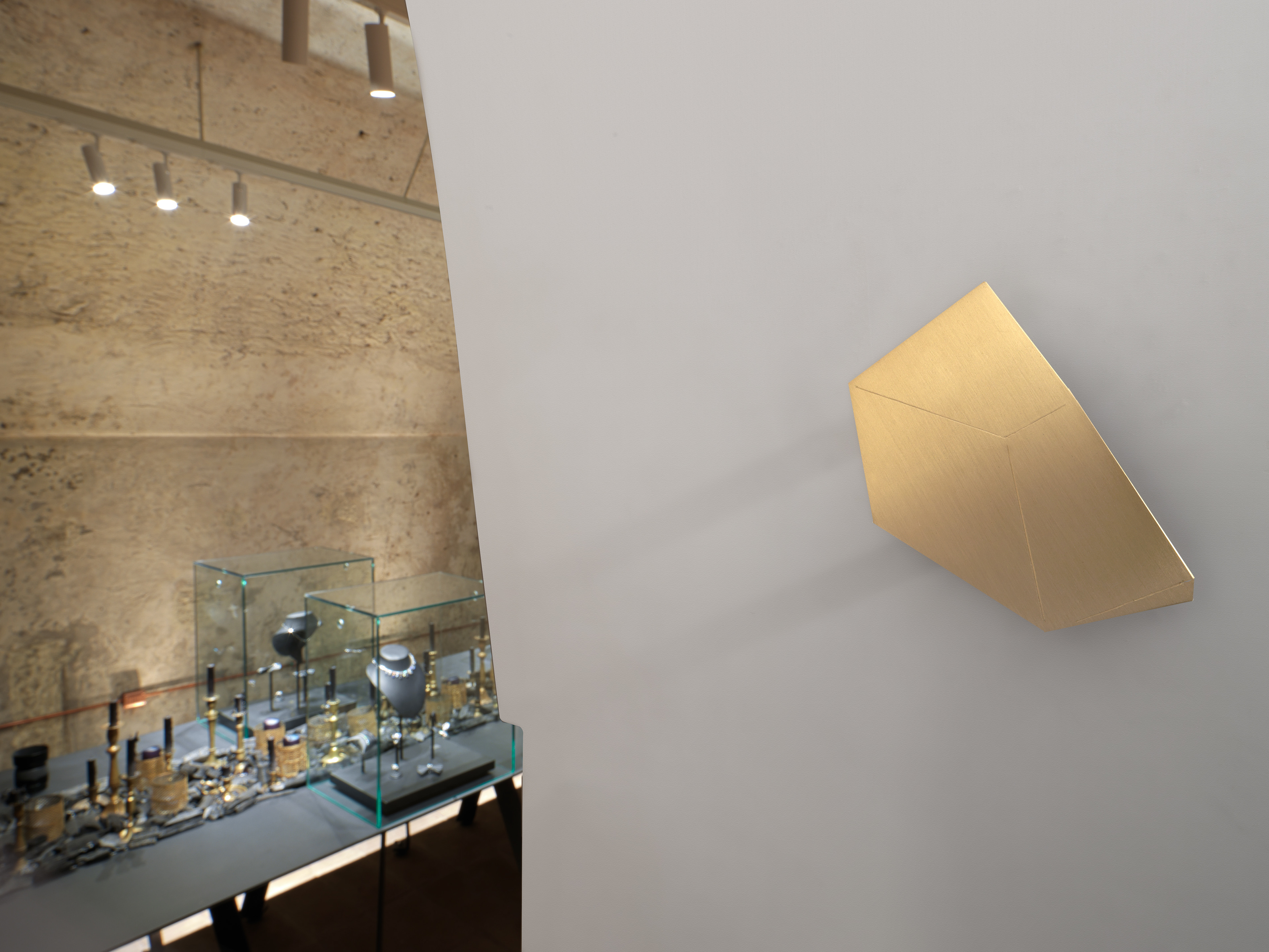
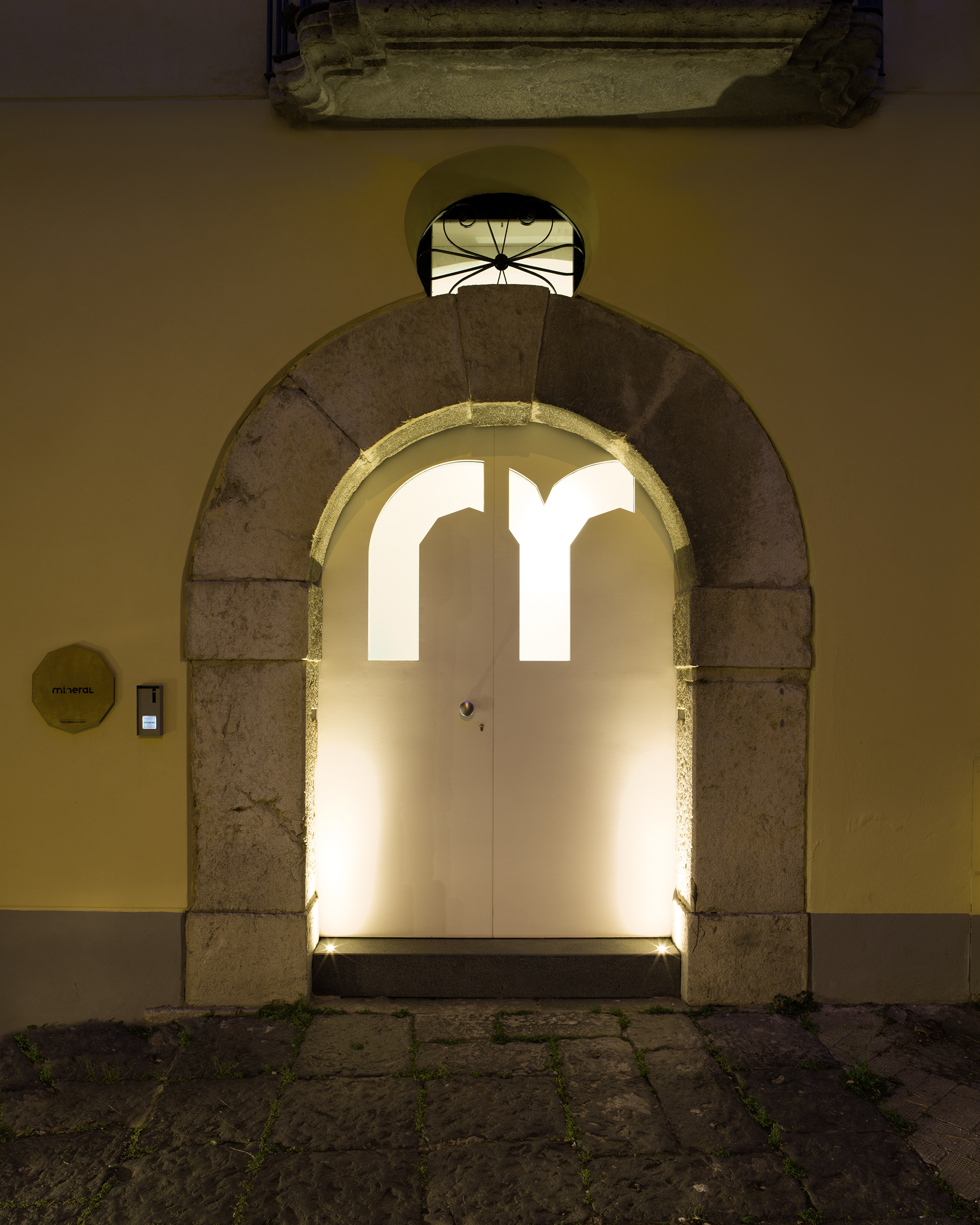
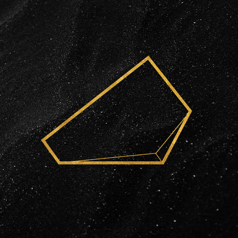
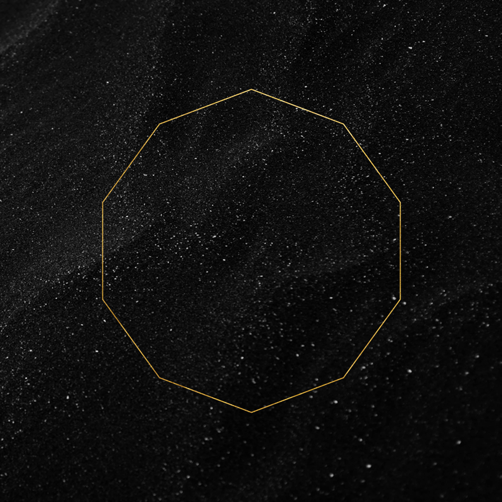
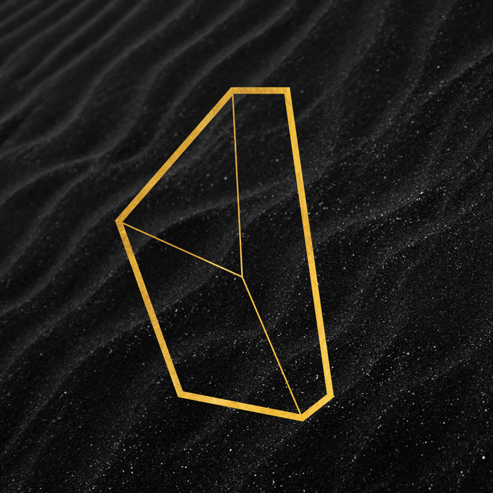
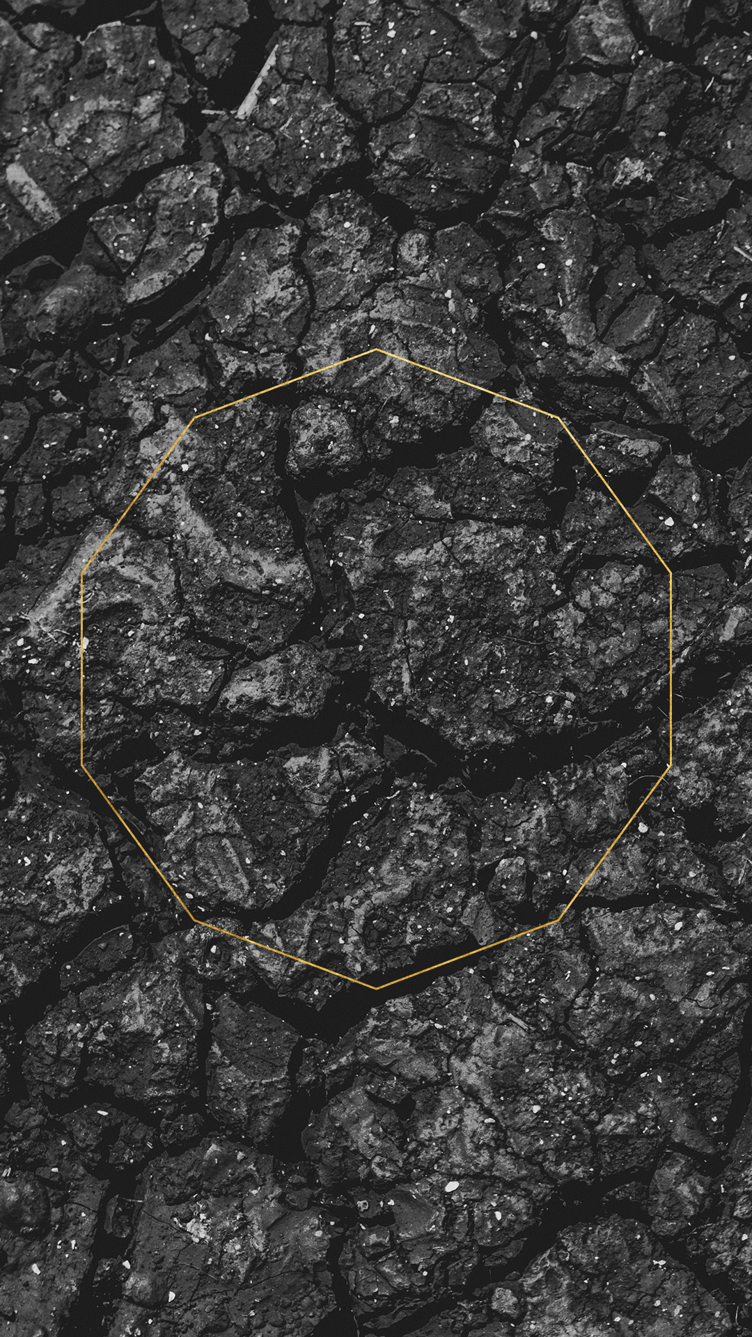
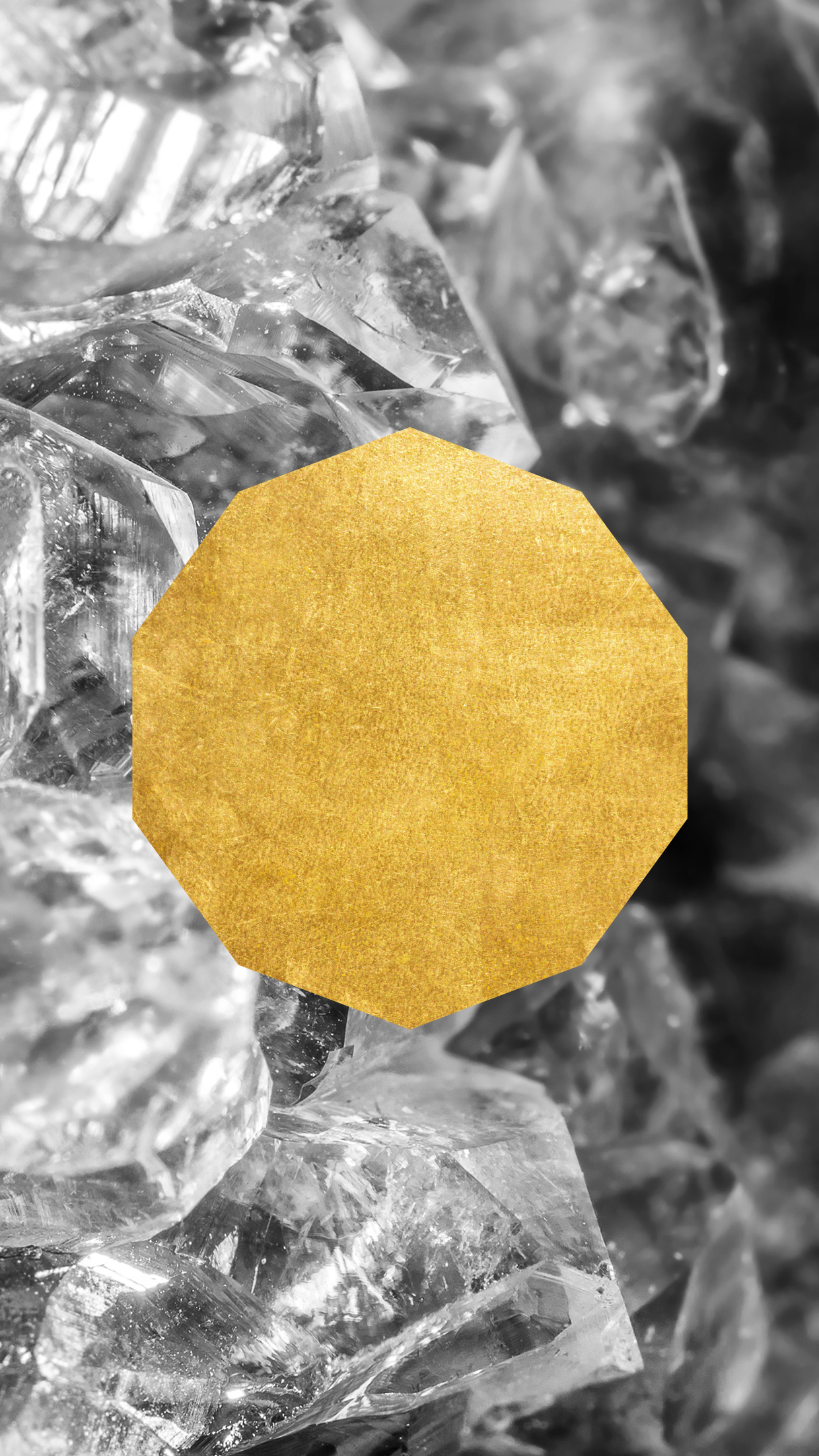
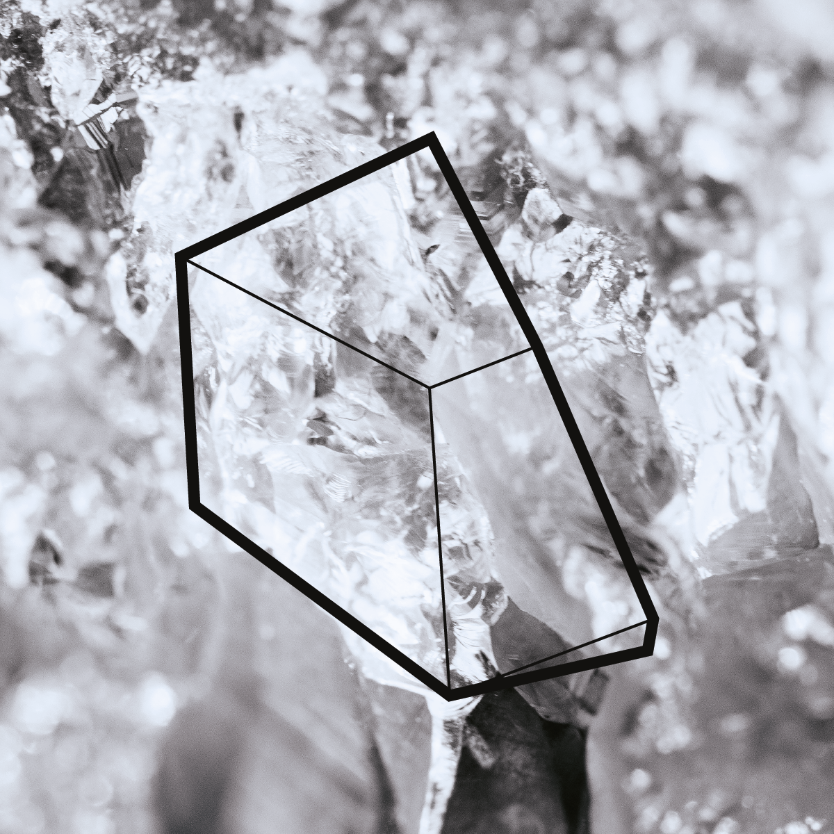
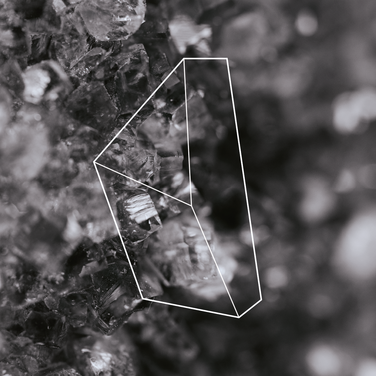
For Mineral, I designed a bespoke typeface for the logotype that embodies the brand's essence. The minimalist, contemporary letterforms feature subtle geometric elements that echo the crystalline structures of minerals. The lowercase presentation conveys approachability while maintaining sophistication, and the distinctive "m" symbol serves as a recognizable shorthand for the brand across various applications.
The typography was carefully crafted to work harmoniously against dark backgrounds, particularly the rich black surfaces that dominate the brand's visual language. This contrast creates a striking visual impact that enhances brand recognition and communicates the premium nature of the experience.
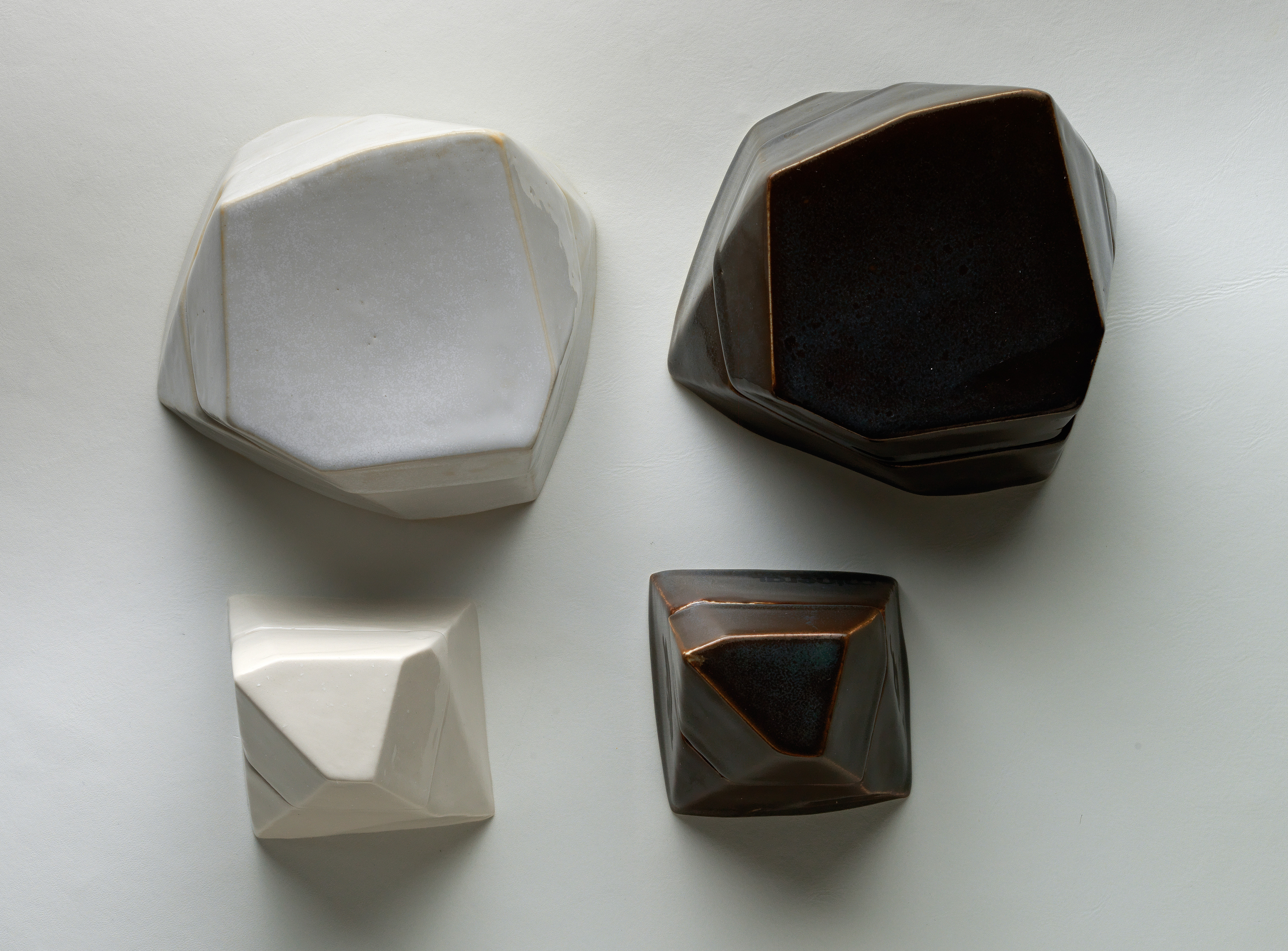
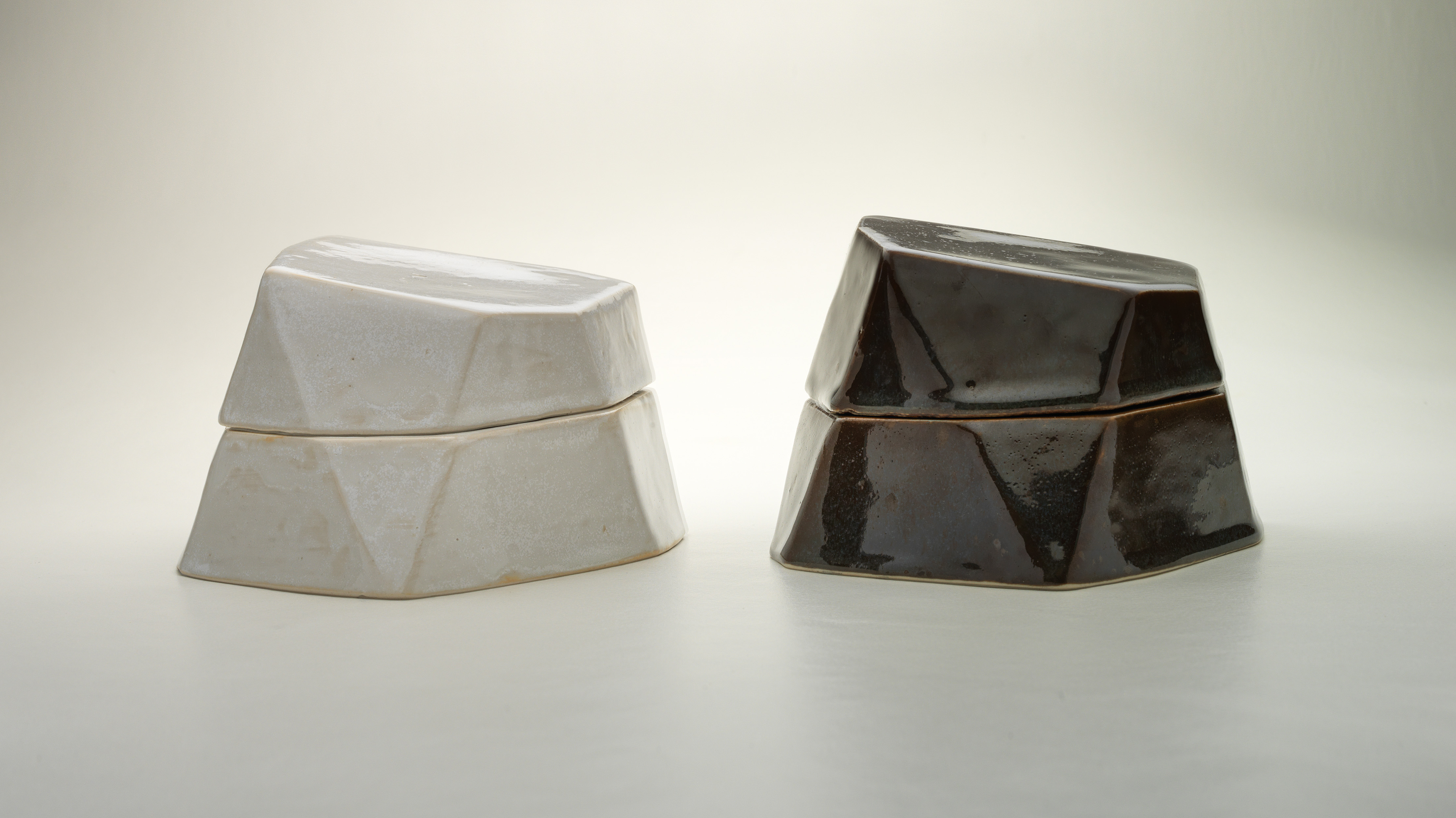
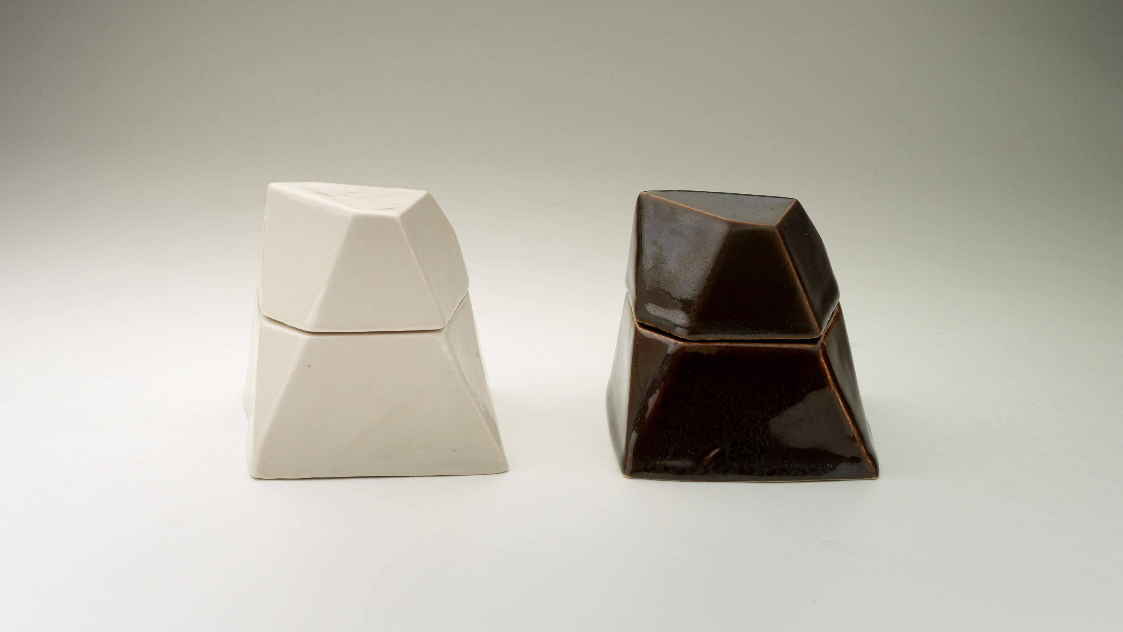
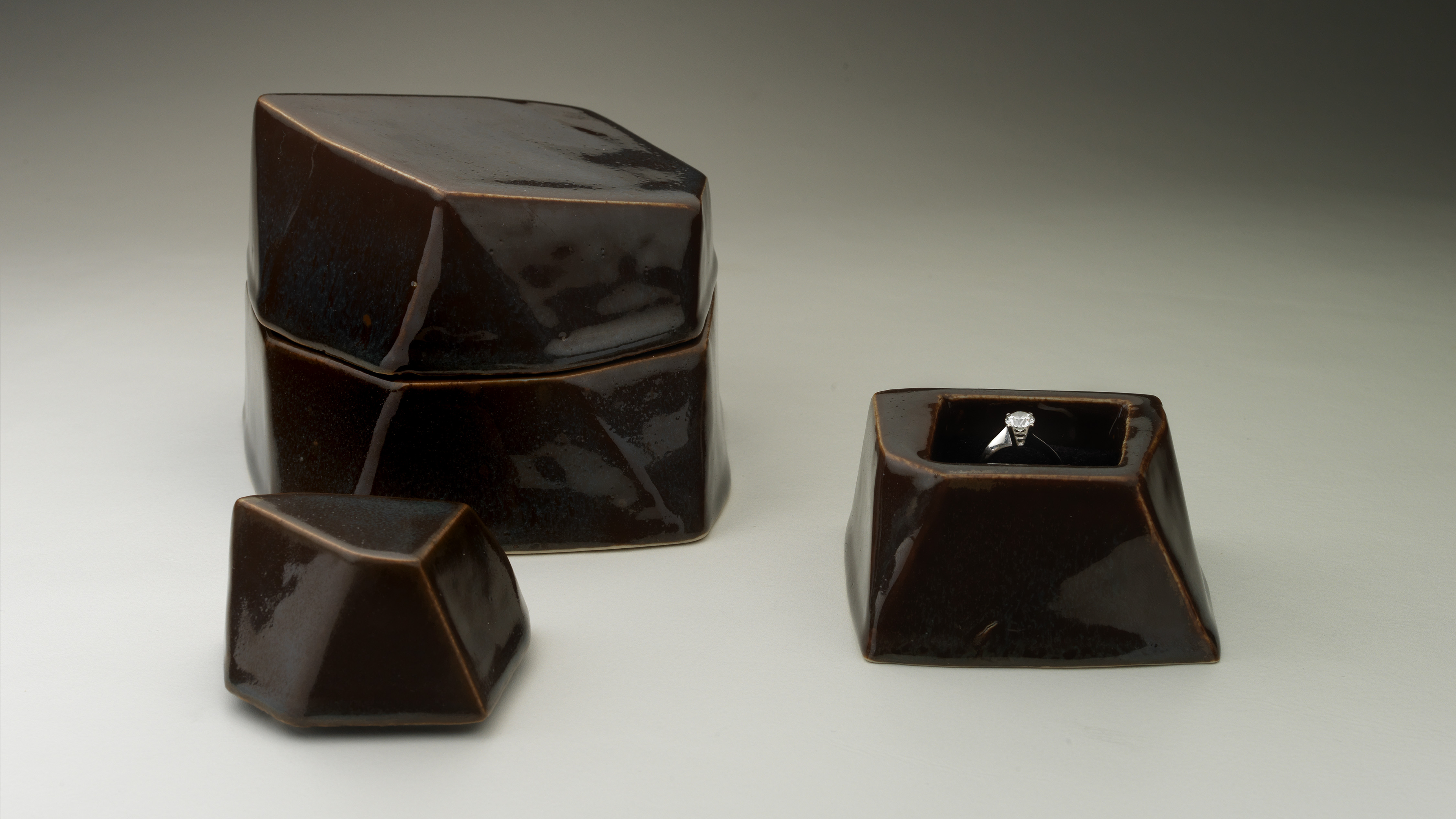
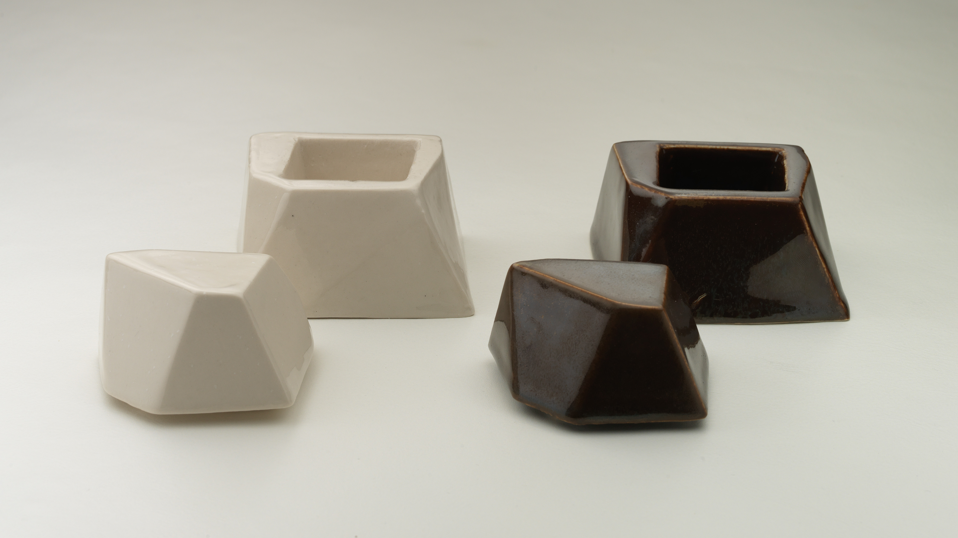
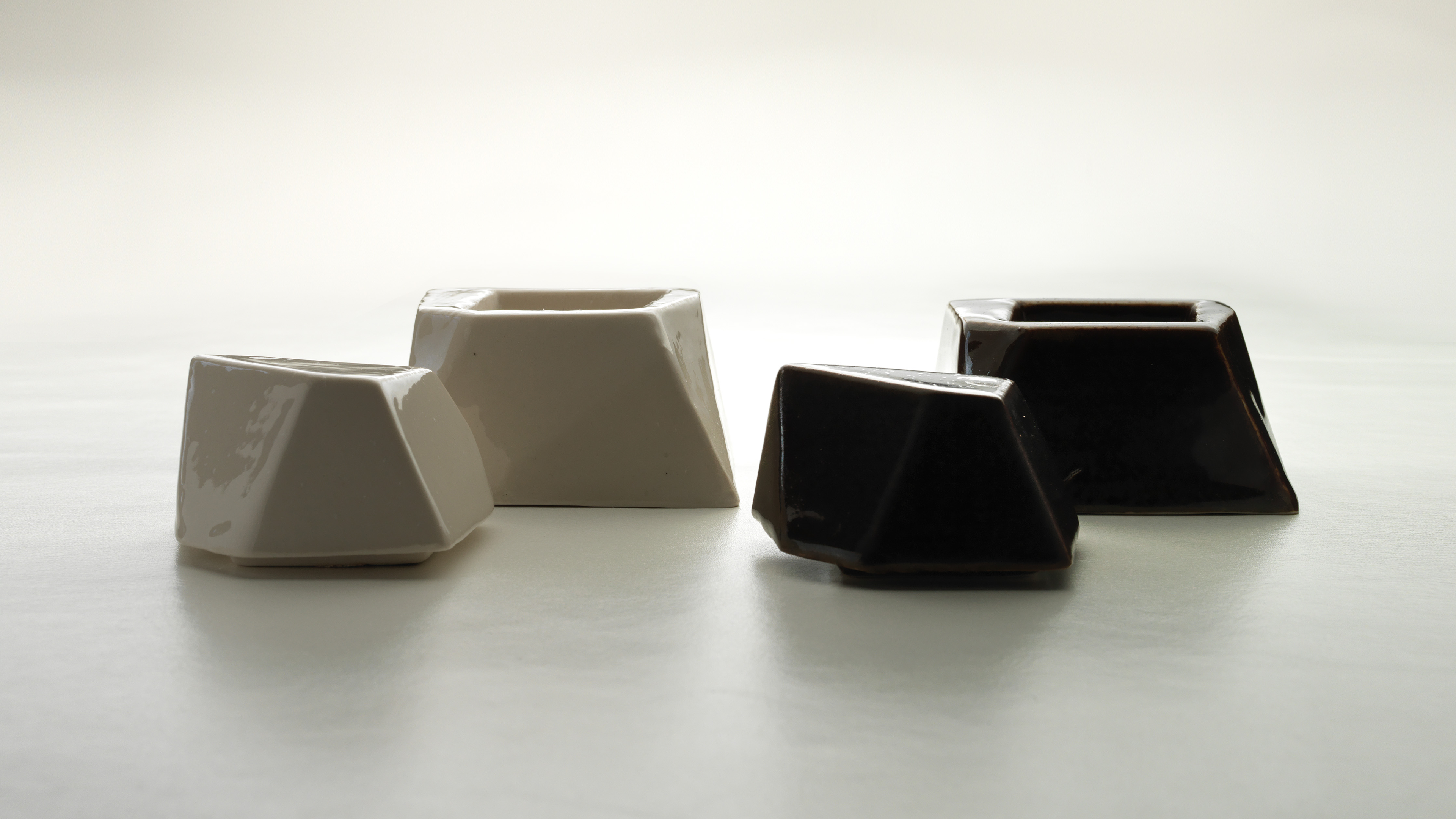


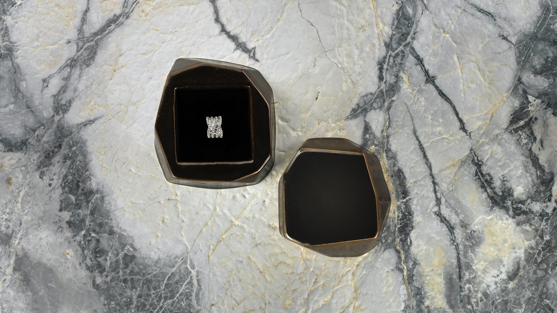
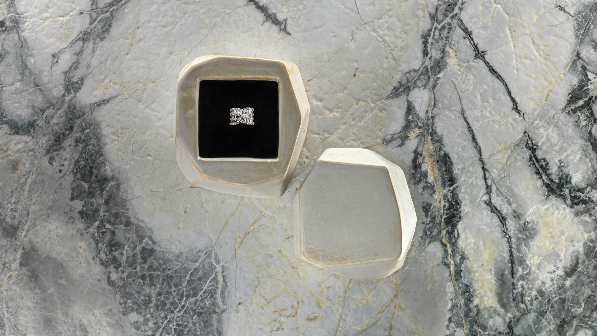
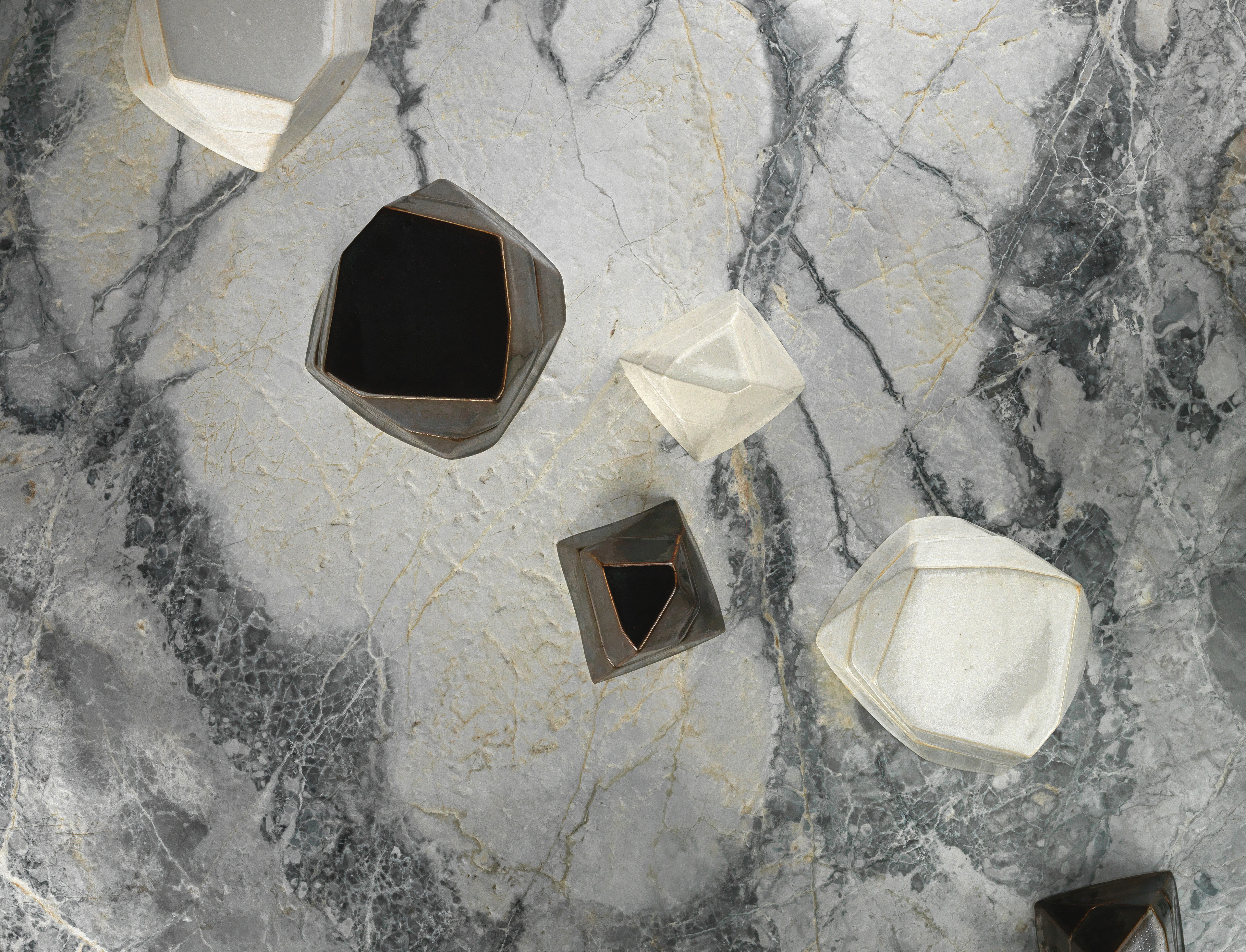
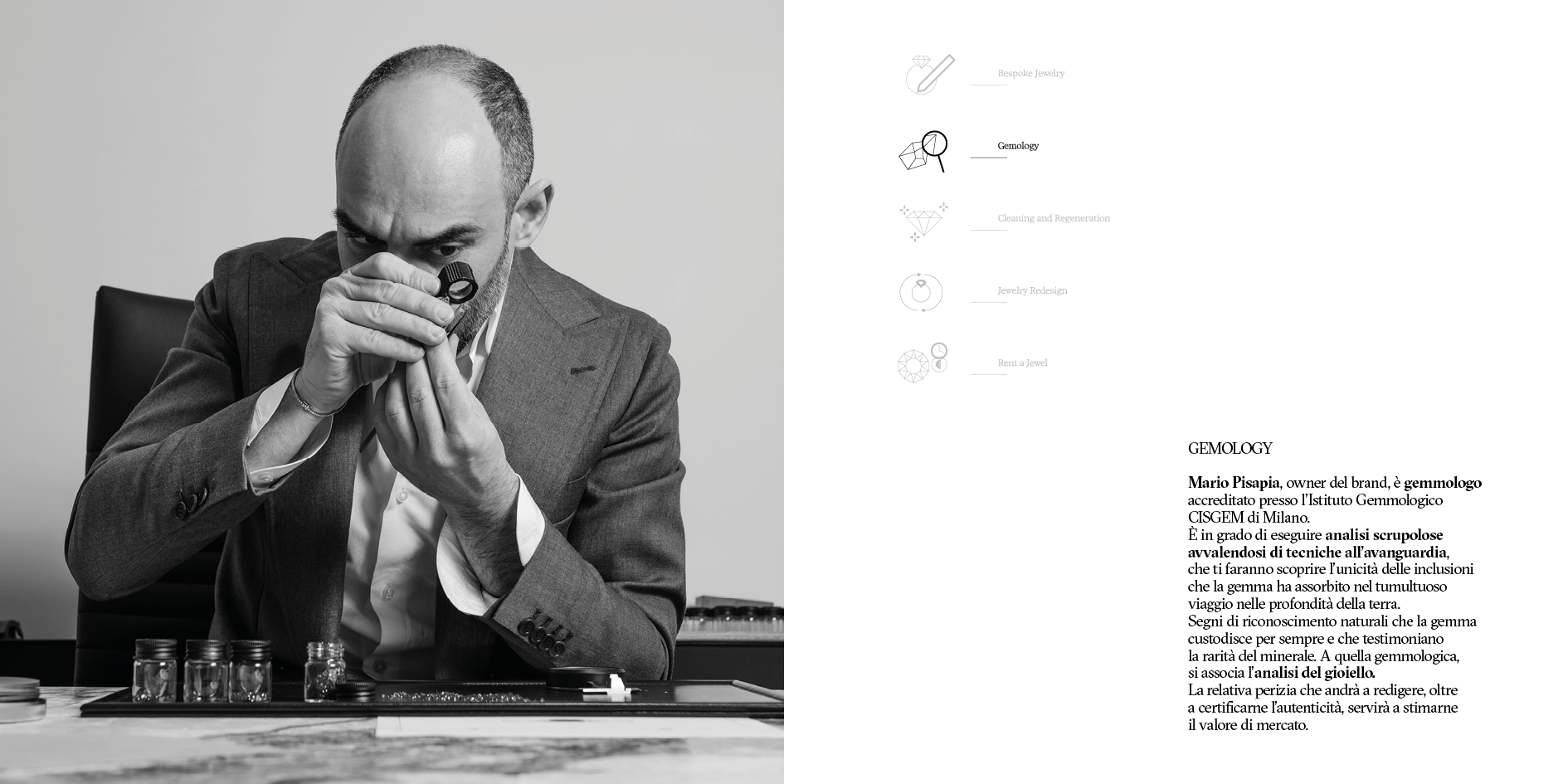
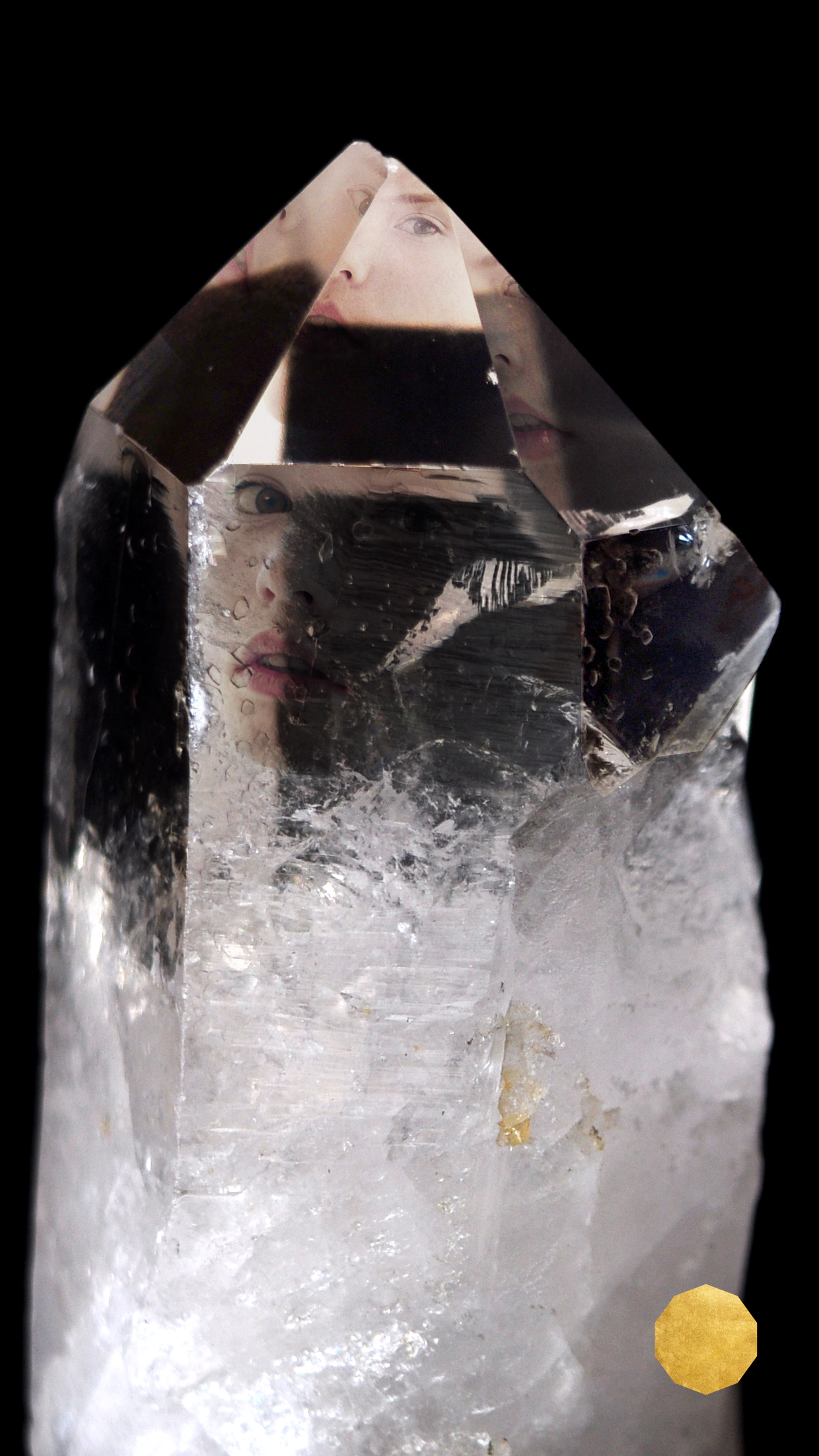
Ceramic Packaging: Elevating the Unboxing Experience
Breaking away from conventional jewelry packaging, I designed a ceramic packaging system that transforms the unboxing moment into a meaningful ritual. Each ceramic container is a work of art in itself—a permanent keepsake that reflects the timeless value of the jewelry it contains.
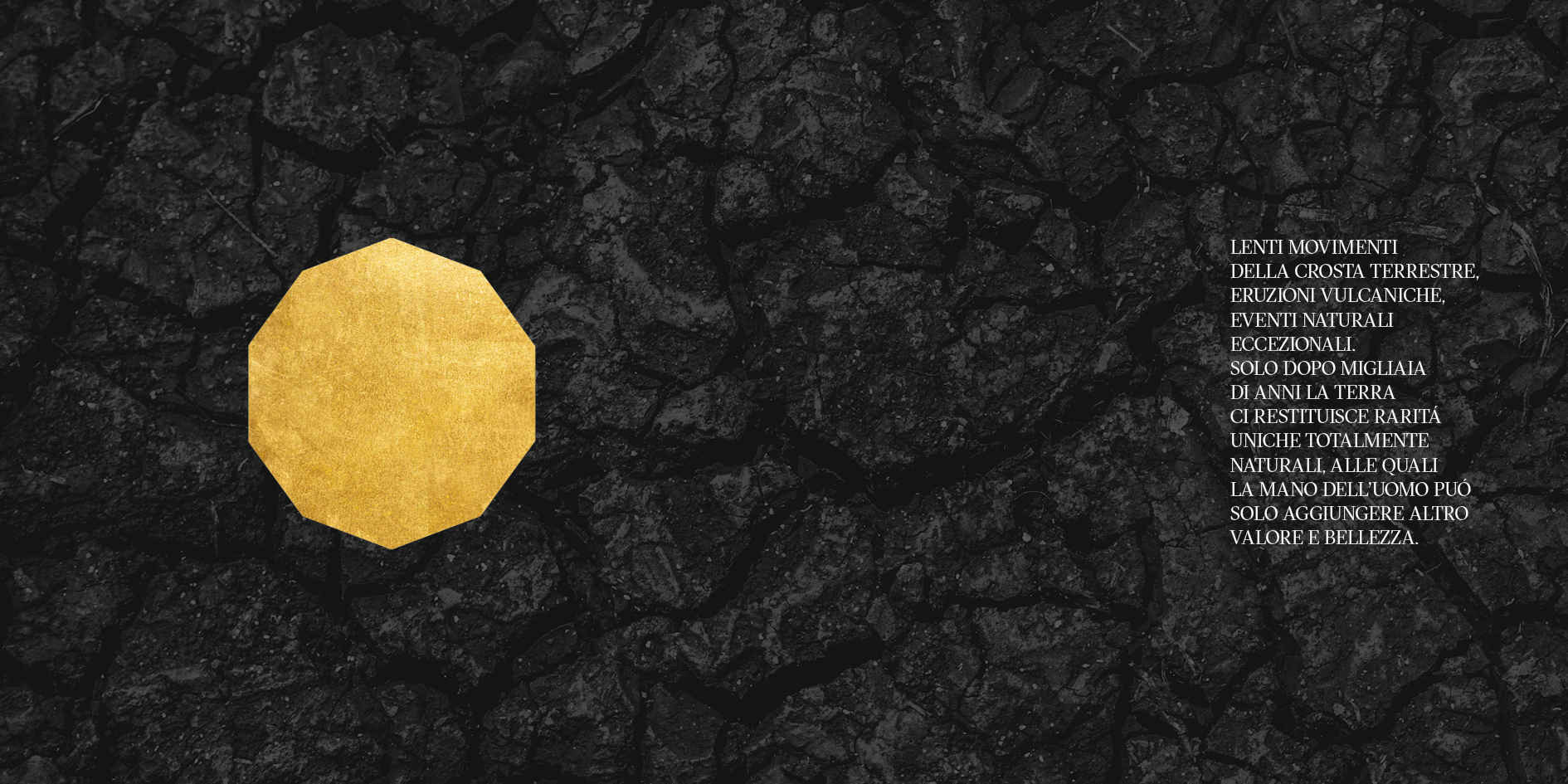
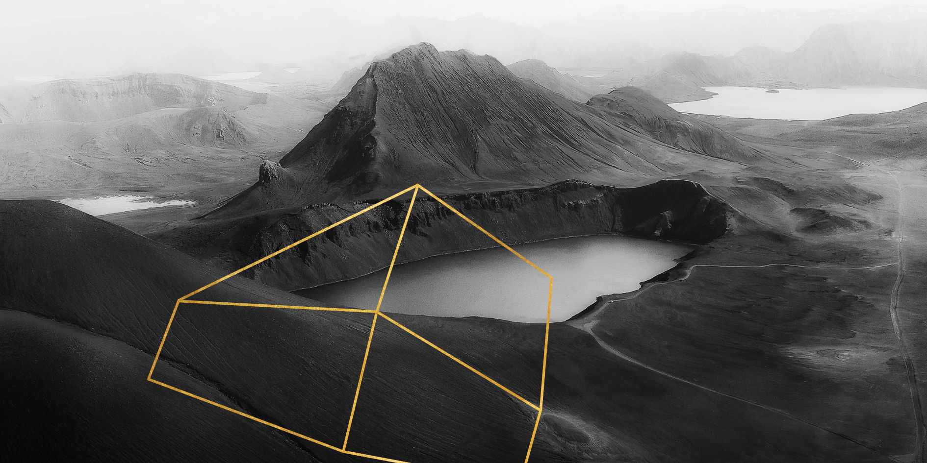
The ceramic material creates a sensory connection to earth elements, subtly referencing the geological origins of the precious stones featured in Mineral's collections. The packaging design employs clean lines and minimalist forms, allowing the natural beauty of the ceramic material to speak for itself while maintaining perfect alignment with the overall brand aesthetic.
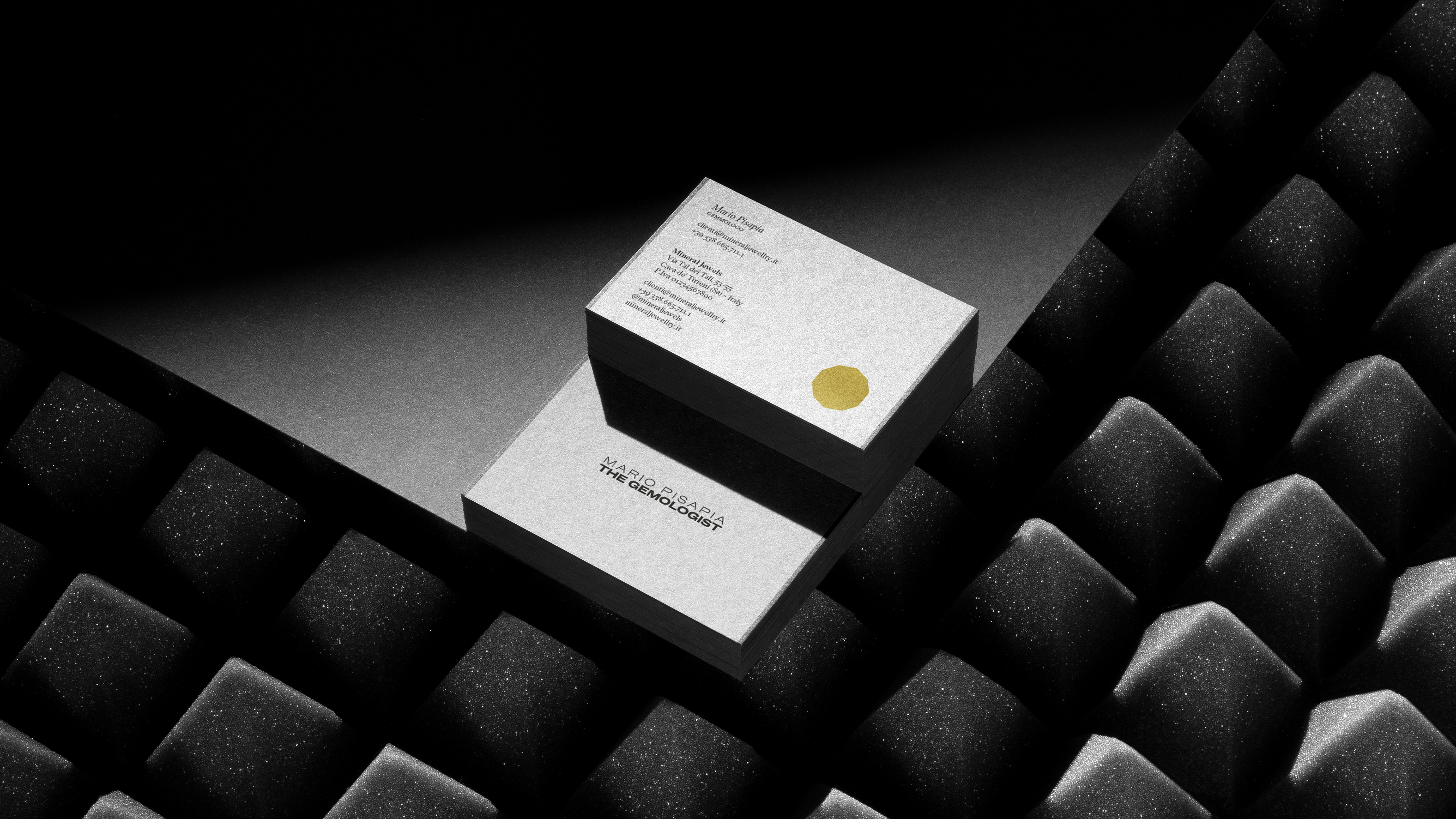
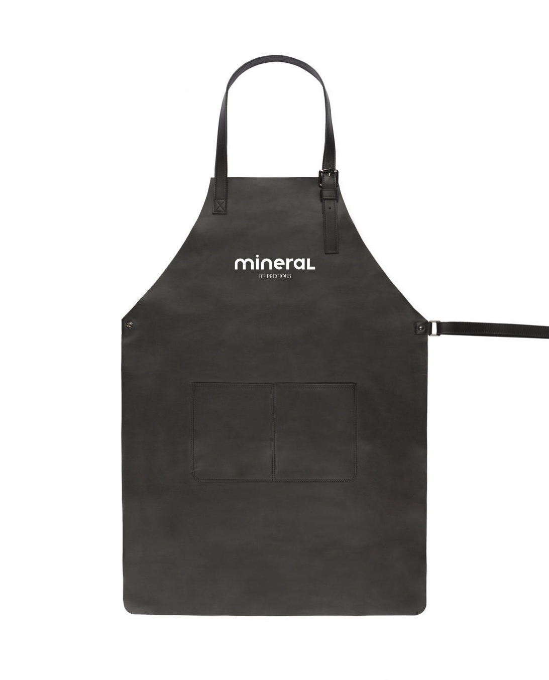
Stationery and BTL Materials: Consistent Storytelling
The stationery and below-the-line materials I designed for Mineral extend the brand narrative across every touchpoint. Business cards, letterheads, envelopes, brochures, and product tags all maintain a consistent visual language while introducing tactile elements that engage multiple senses.
I selected premium papers with subtle textures that complement the ceramic packaging, creating a cohesive sensory experience. The materials feature the brand's signature typography and minimalist design approach, reinforcing brand recognition while conveying quality and attention to detail.
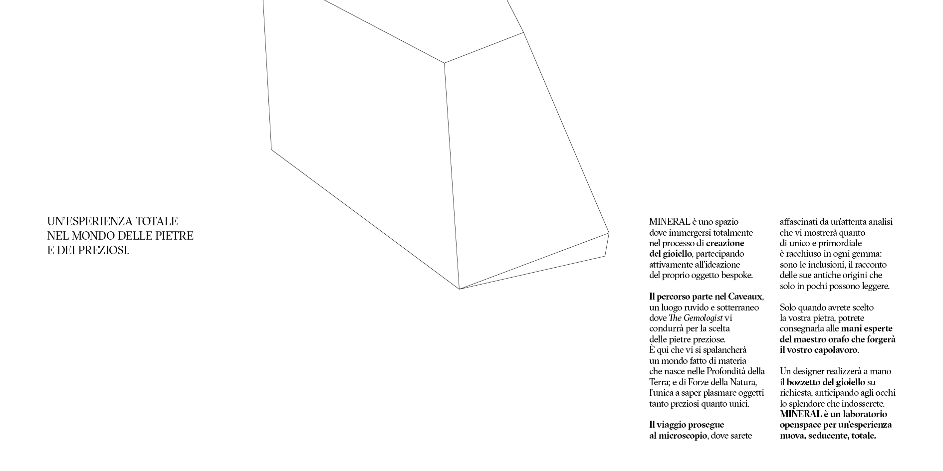
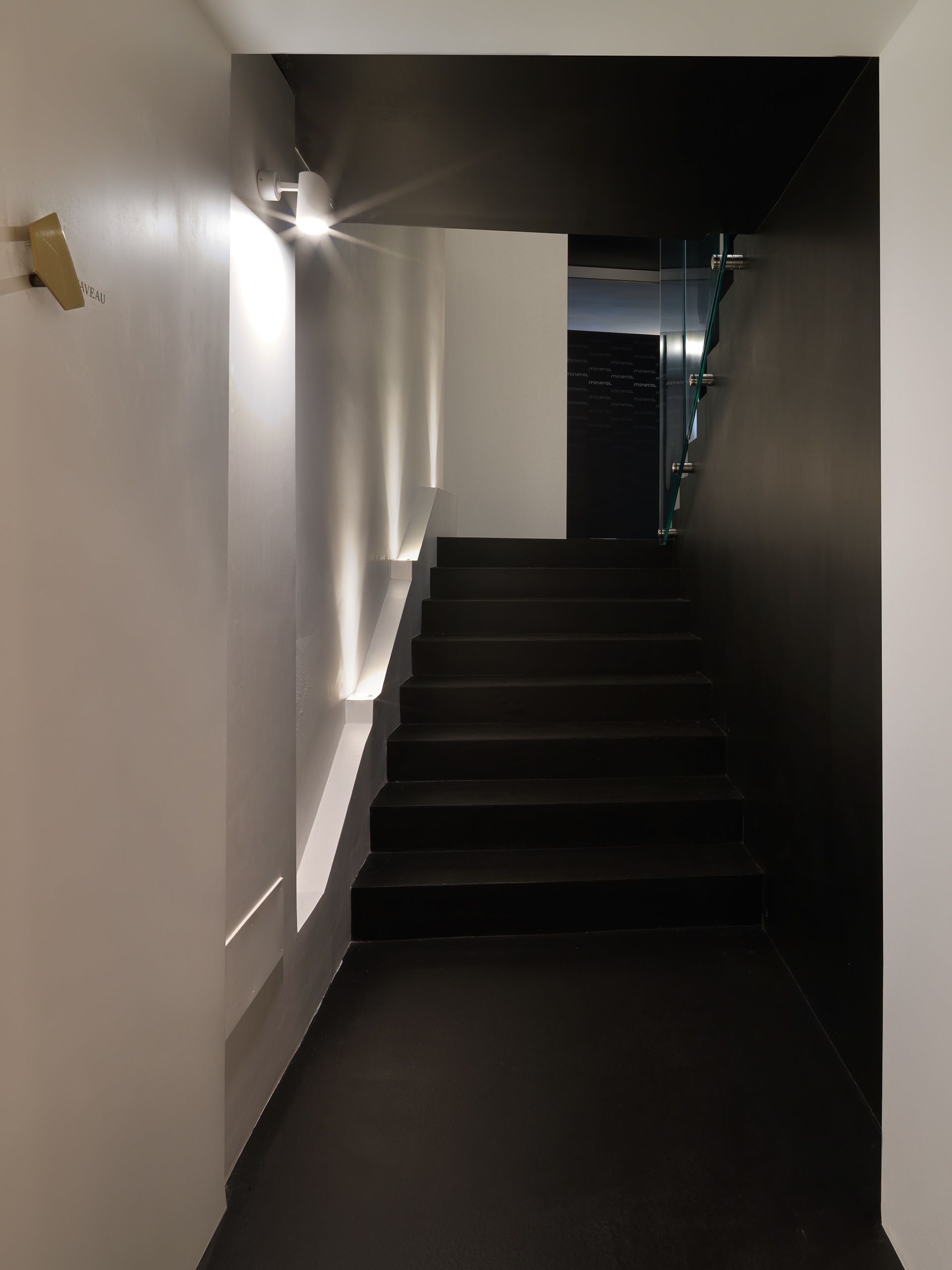
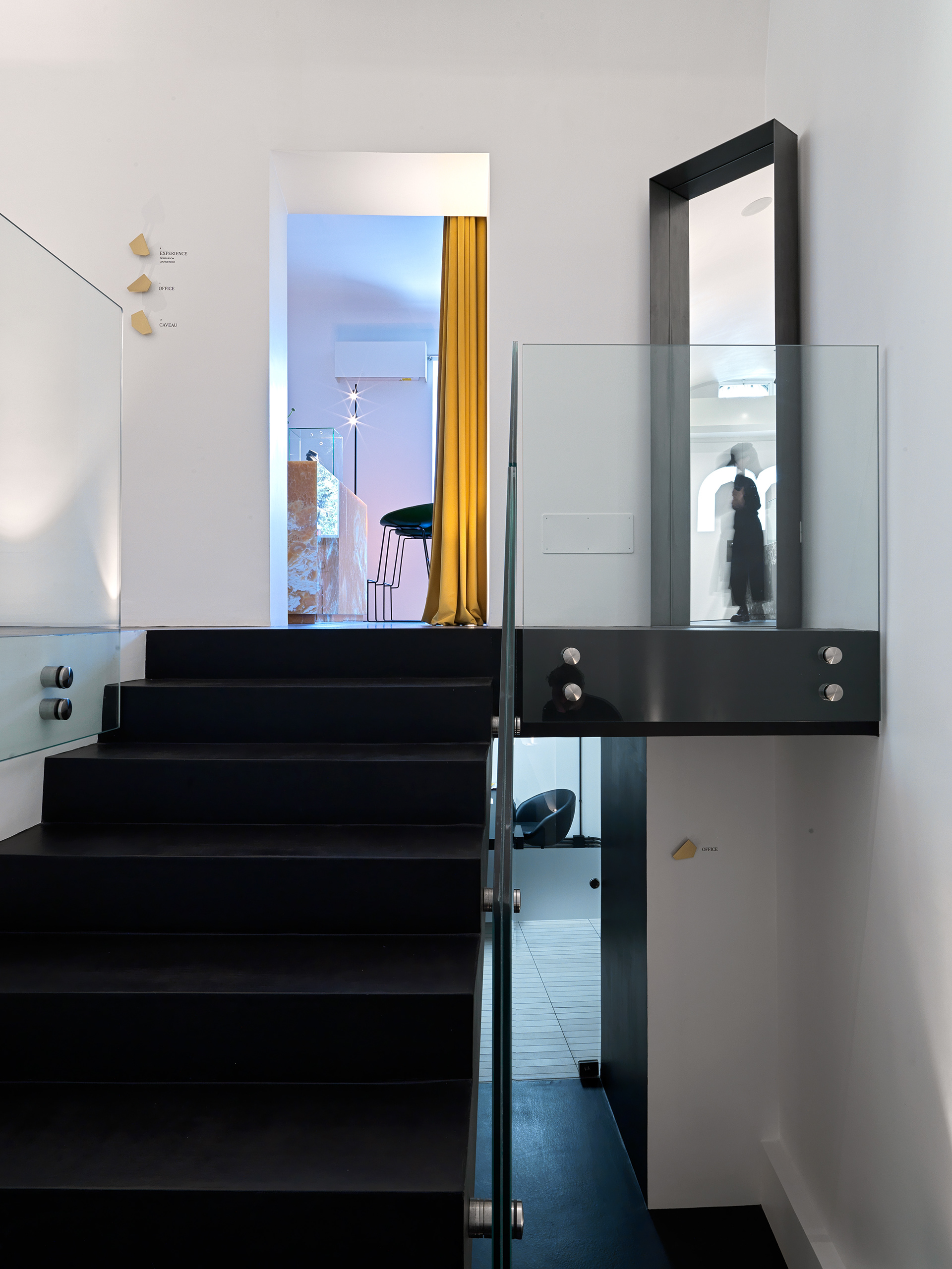
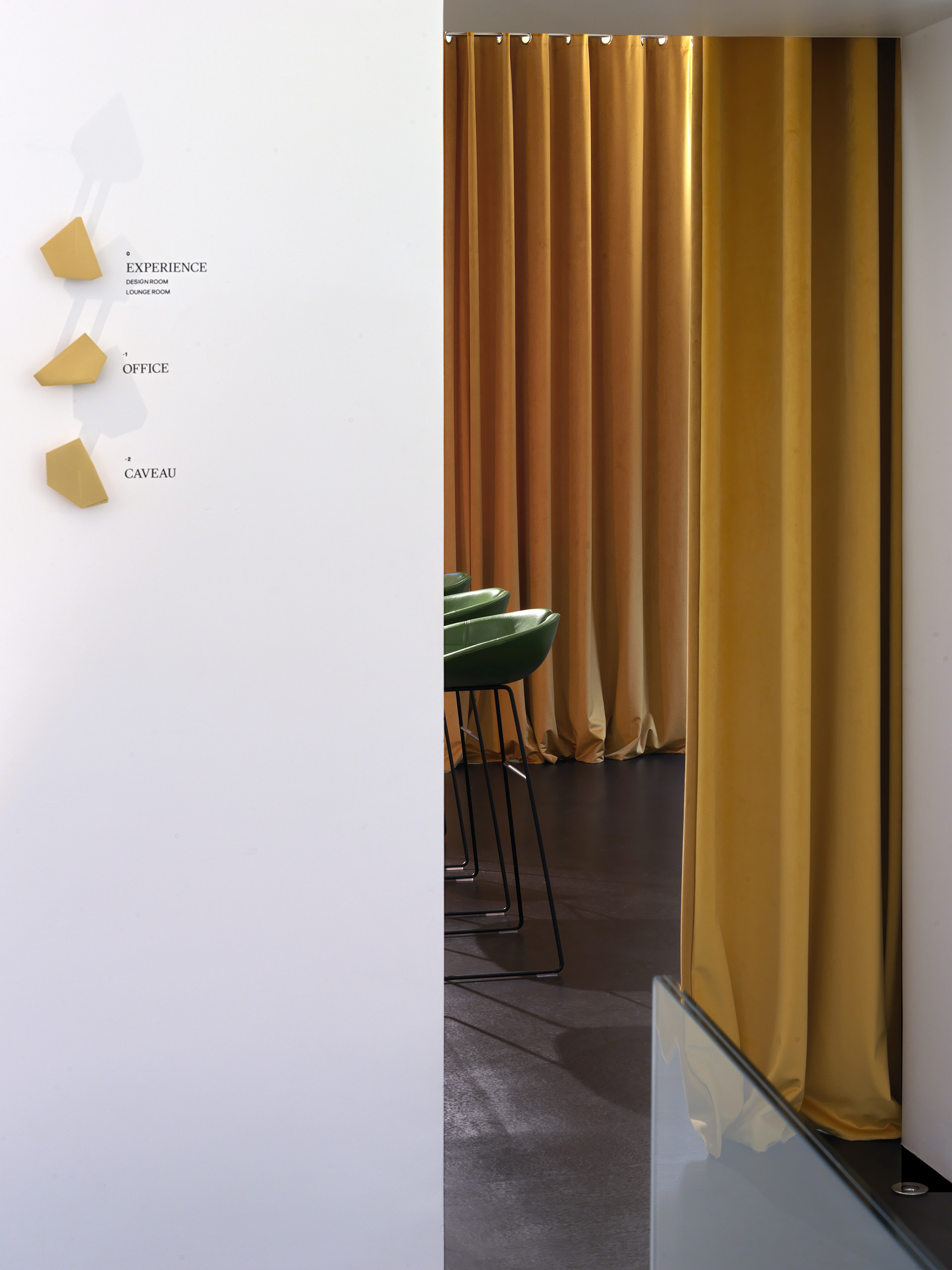
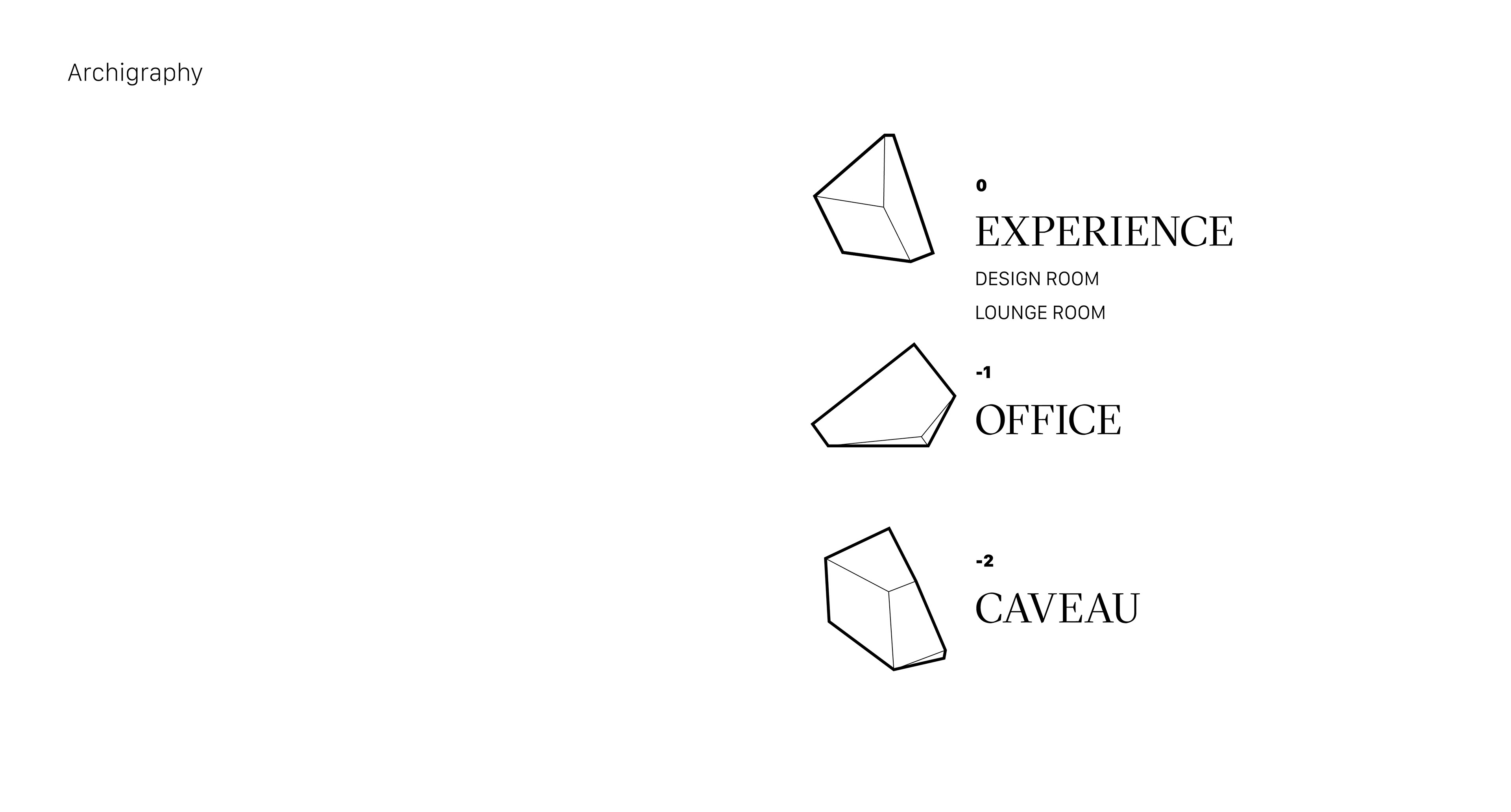
Architectural Inspiration: Crafting the Physical Experience
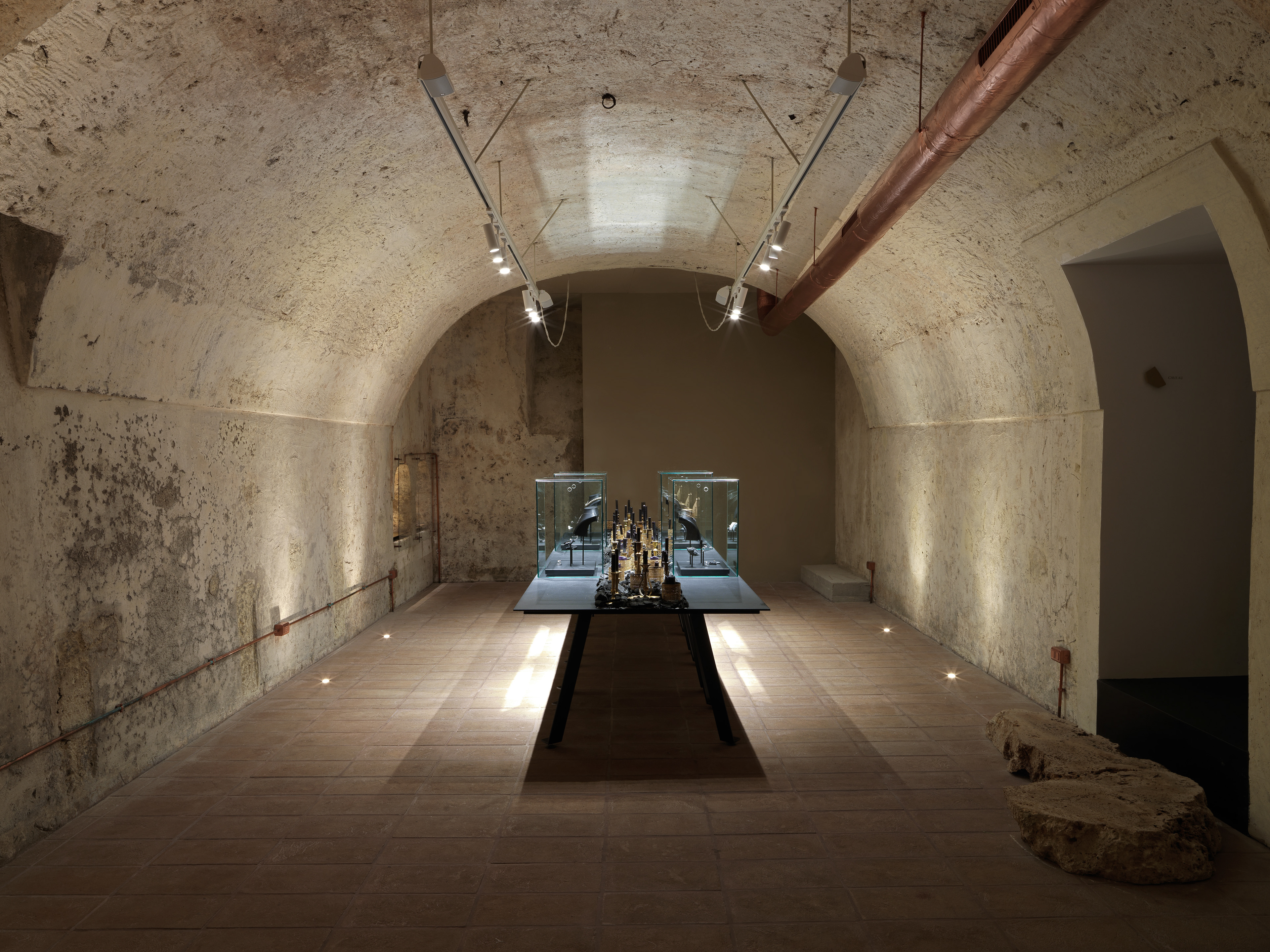
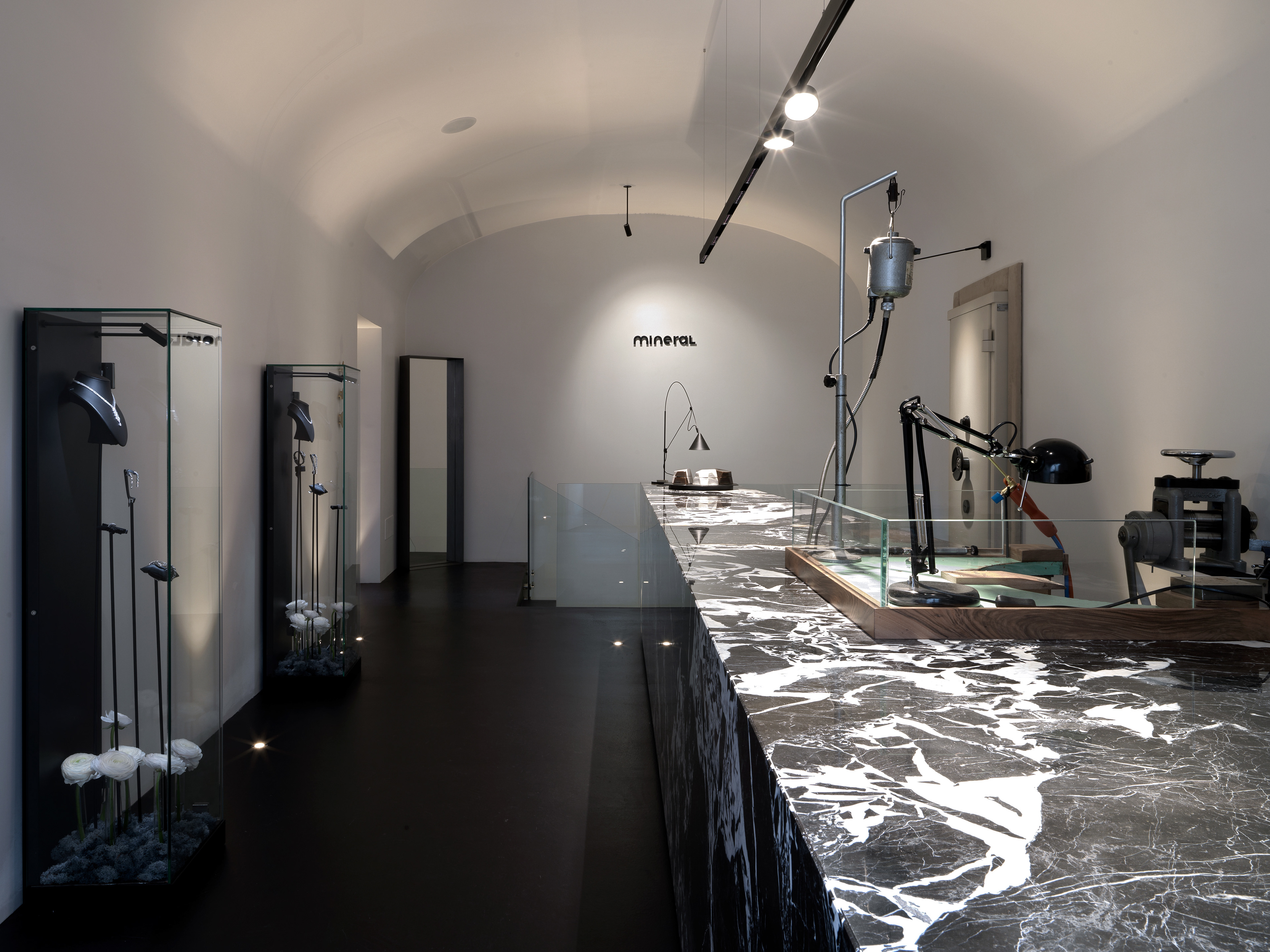
My design vision extended to inspiring the architectural concept of the Mineral space—a two-floor jewelry atelier that functions as a concept store. The space was conceived as a journey of discovery, where visitors can experience the complete story of gemstones and jewelry creation.
The design features distinctive elements like the irregular black marble counter that hosts a Neapolitan goldsmith's bench, creating a visual focal point that celebrates craftsmanship. The second floor incorporates a vault built within an old cistern, where custom-designed display cases feature stems that elevate diamonds to their apex—a physical manifestation of the brand's philosophy of elevating preciousness.
Soft velvet drapery and carefully designed lighting create an intimate atmosphere that invites visitors to develop a personal relationship with the jewelry. Every architectural element was considered as part of the brand experience, from the visible workshop where master goldsmiths practice their craft to the fitting room where customers can try jewelry with their outfits.


Digital Tools: Extending the Experience Online
I designed Mineral's complete digital ecosystem, including the website and social media presence, ensuring a seamless extension of the physical experience into the digital realm. The website features the same minimalist aesthetic, with a dark background and golden geometric elements that echo the physical store's design language.
The user interface prioritizes simplicity and elegance, allowing the jewelry to remain the focal point while providing an intuitive navigation experience. The social media strategy I developed maintains consistent visual storytelling across platforms, building a digital community around the brand's unique philosophy.
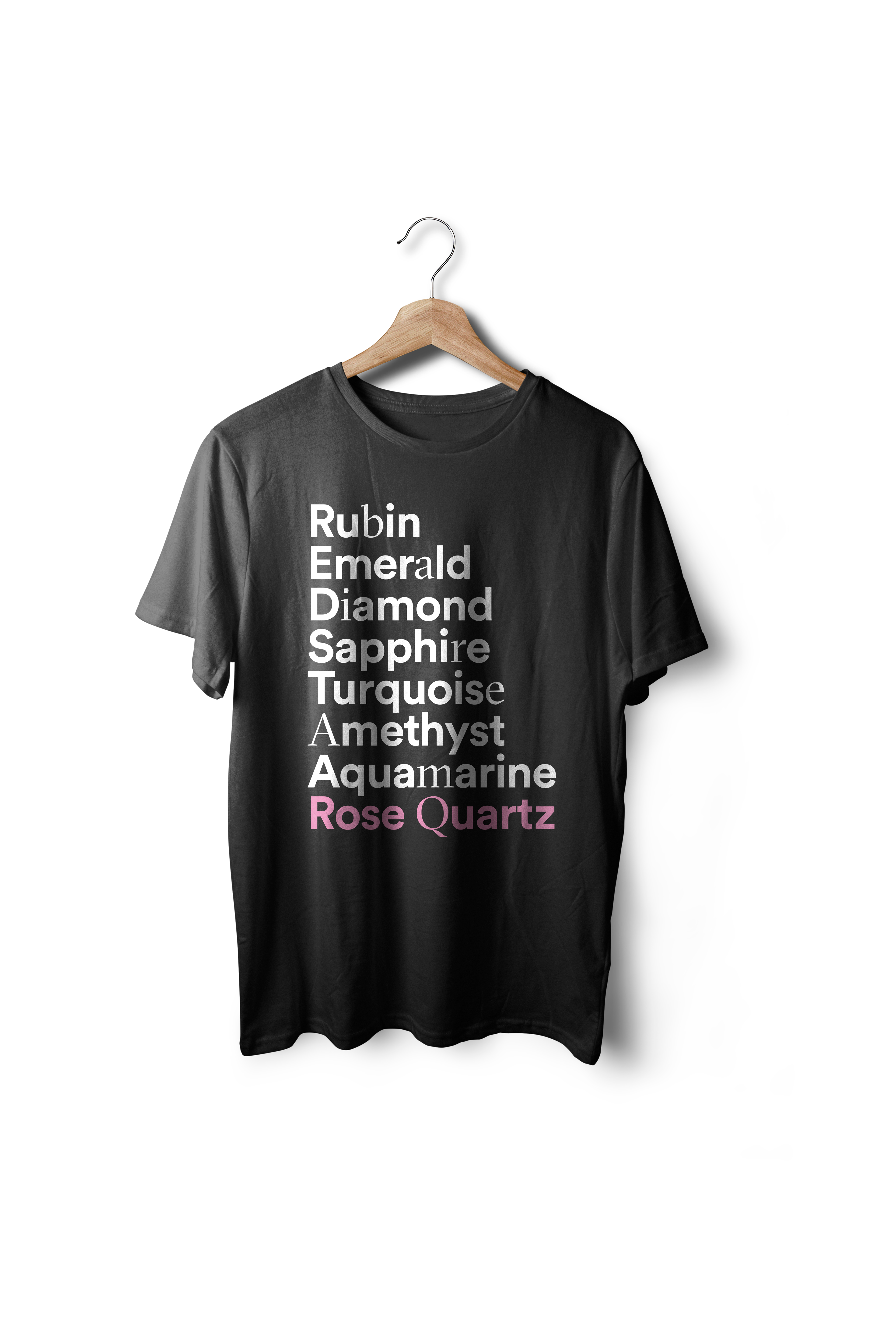
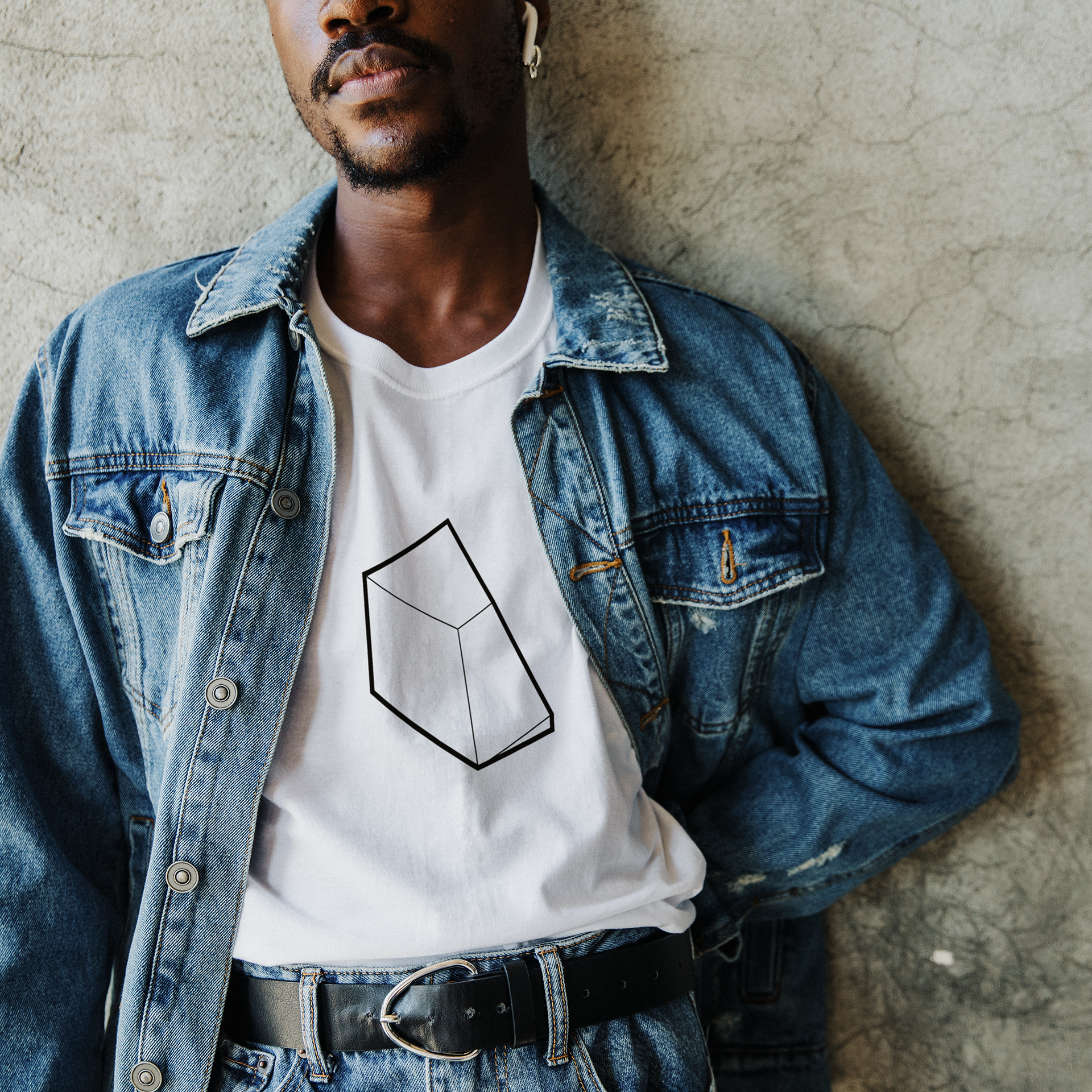
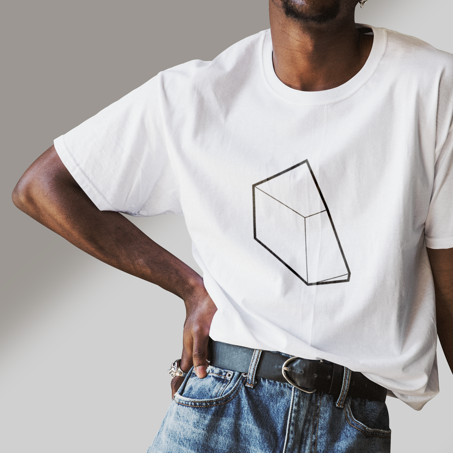
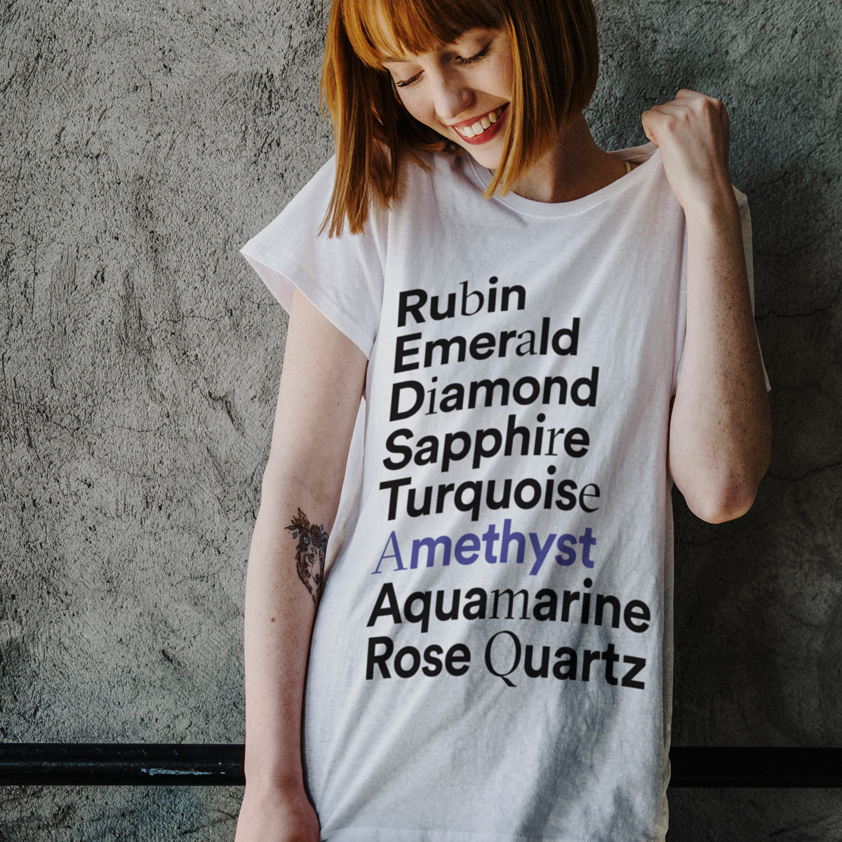
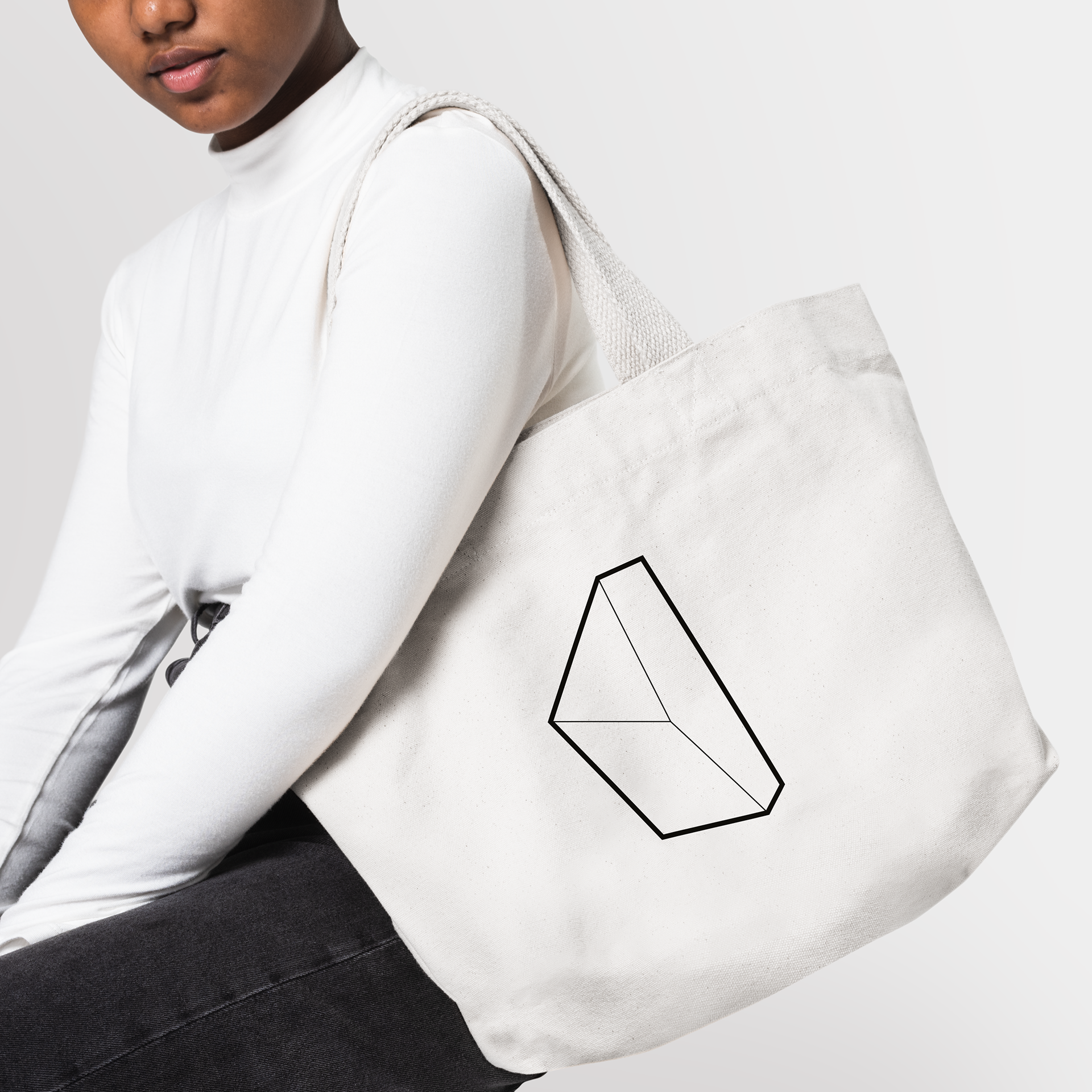
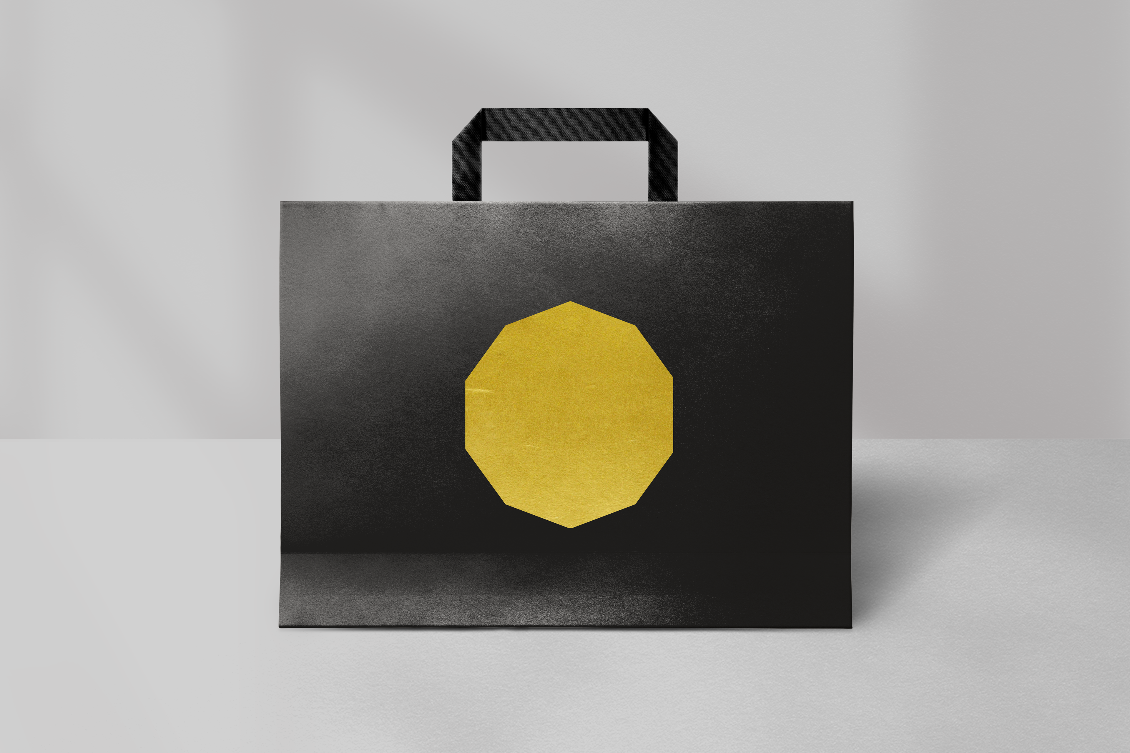
Merchandising: Expanding the Brand Universe
To complete the brand experience, I designed a range of merchandising items that allow customers to bring elements of the Mineral universe into their daily lives. Each item maintains the brand's distinctive aesthetic while serving a practical purpose, further cementing brand loyalty and recognition.


A Unified Brand Experience
The comprehensive design approach for Mineral created a unified brand experience across all touchpoints—from the first glimpse of the logo to the moment of unboxing a new piece of jewelry, from the physical store visit to the online browsing experience. By designing every element with a consistent vision, I established a distinctive brand identity that stands apart in the luxury jewelry market.
This holistic design approach not only elevates the perception of the brand but also reinforces its core philosophy: celebrating the uniqueness of each individual through thoughtfully designed experiences and objects of lasting value.
www.mineraljewelry.it
www.mineraljewelry.it